- Introduction
- The data (and a disclaimer)
- The growth of YouTube
- Peak YouTube?
- Measuring interest: what are we (not) watching?
- How popular is my video or channel?
- There’s lopsided interest…but is it the Power Law?
- Is this normal?
- Double-checking the fit
- Familiarity breeds likes and dislikes: views versus other popularity metrics
- Does size matter?
- Aging like wine…or milk?
- Categorically popular
- Wordiness: titles, descriptions, and tags
- Things that maybe, possibly should be random: the first characters of titles and popularity
- Things that definitely should be random: YouTube video IDs
- So many cameras: where people are recording videos
- Timing is…everything?
- Projects that were inspired by this study
- Methodology: Introduction
- Methodology: Constructing the panel
- Methodology: More random, please
- Methodology: Choosing the order
- Methodology: On the use of 4-character strings
- Methodology: Collecting the data
- Methodology: R
- Methodology: Fitting distributions
- Methodology: Programming notes
- Methodology: Zeros
- References
It all began with this video:
This 18-second masterpiece was the first video posted to YouTube by company co-founder Jawed Karim on April 23, 2005. “Me at the zoo” kicked off a chain reaction that feels like some combination of the invention of the printing press, fast food, and the VCR. When it comes to distributing moving images, YouTube made it possible for anybody to post a video that everybody could see. For consumption, you can now watch exactly what you want, when you want. Everything on the spectrum of culture, from highbrow to lowbrow, is on there: if YouTube were a restaurant, it would serve both greasy burgers and the fanciest haute cuisine. As a cultural phenomenon, I can’t tell you the number of times I’ve heard someone start a conversation with “So I was watching this video on YouTube…”
A decade later, on-demand video is also changing our lives beyond mere instant gratification. “I learned that on YouTube” is also a phrase I’ve heard countless times. The educational value of video is democratizing how we help each other. Everybody is good at something: now, with only a cheap camera and a few clicks, you can teach other people what you know. Personally, I’ve learned how to reset the “check engine” light on my car, how to replace the hard drives in a variety of computers, how to locate and charge the battery on my motorcycle, how to make the “special sauce,” and much more.
That all sounds very high-minded, but you’re probably wondering what prompted this study. Was it to honor the milestone of the first decade of this cultural juggernaut? No. Truthfully…it’s a Korean rapper who dresses ironically in formalwear. Yep, I’m a fan of PSY’s Gangnam Style. Recently, I checked in on this mega-hit and found that it had over 2 billion views. Whoa. That figure blew my mind, but there was a secondary explosion when I learned it was about double the runner-up. Contemplating Gangnam Style’s huge success dovetailed nicely with some ideas that have been floating around in my head. Lately, I’ve been seeing a lot of references to the Power Law and the impact of unexpected outliers, both in Taleb’s brilliant The Black Swan and also in a variety of articles about the ins-and-outs of angel investing.
I did some searching and I’m definitely not the first person to think that the Power Law might describe the popularity of YouTube videos. However, I wasn’t able to find a study that addressed it directly or in-depth, so I thought I’d do my own. Then, the project took on a life of its own: sometimes, you start peeling the onion and there’s no end to the questions. I became a bit obsessed with this topic and the result is this 11,000+ word study you’re reading. I originally just wanted to see if the views of YouTube videos followed the Power Law, but that led to many other interesting threads that I just had to follow. Also, as my capabilities with the YouTube API and R grew, so did my ability to ask and answer more difficult questions about the data.
To produce this study, I collected and analyzed the metadata of over 10 million videos using Google’s YouTube Data API. To assemble this panel of videos, I threw random 4-character strings at YouTube’s search engine (e.g., "-AXN", "f2zg," etc.). When you query the search engine, you must also choose a sorting order from among: 'relevance', 'date', 'title', 'rating', and 'viewCount.' However, before I collected the full dataset, I ran some tests to compare these various sort methods, trying to determine which one would give the most “random” results. Based on these trials, I chose 'title' as the sort method. Please see the methodology section of this study for a detailed explanation of how I collected the data, compared the sort options, as well as my rationale for using random 4-character strings to query the search engine.
Disclaimer: please note that many of my conclusions are based upon the premise that my collection methods yielded random data. However, I have no way of verifying that the data I gathered was in fact random: the YouTube API is a black box and I don’t have access to the technical details of how their search engine works. Whether these videos are a representative sample, and therefore fit to make conclusions about YouTube as a whole, is unclear. I’m neither a statistician, nor do I play one on TV. This study has not been peer reviewed, nor the results replicated by others; while I tried to prevent errors, they could be present in my code. So, don’t base any important decisions on the analyses given here. In the methodology section, I’ve tried to be completely transparent about how this study was conducted, should you want to attempt reproducing these results on your own. Please do!
Below is a table detailing the amount of data that was collected. You can see that searching produced some duplicate video IDs. Also, for a small percentage of these videos I was unable to retrieve their metadata:
| Collecting metadata with the YouTube Data API | |
| Stage | # of resulting video IDs: |
| Search | 11,720,992 |
| After deduplication | 10,182,114 |
| Successful metadata retrieval | 10,175,093 |
| Data collected October 27-30, 2015 | |
By all accounts, YouTube is the kind of Internet business that entrepreneurs and venture capitalists fantasize about: incredible growth followed by an exit north of a billion dollars. It doesn’t get better than that (well, at least until Whatsapp came along). YouTube relies on user-generated content, so let’s get a sense of the growth in videos uploaded to the platform:

Assuming the data I collected are representative of YouTube as a whole (again, see the methodology section), it’s clear that uploading continues to grow apace. 2015 isn’t even over yet, but the number of videos uploaded this year already far exceeds 2014 (which beat 2013, and so on).
What about views over the same timeframe? Unfortunately, you can’t calculate this statistic with the data I collected because, for a given video, views are given as all-time. That is, you know the total but you don’t know when those views occurred. For example, take a video published on January 23, 2006 with 100 views: those views could have happened entirely on the day it was uploaded or gradually from then to now. I came up with this chart instead, which shows the share of all views from each year’s uploads:
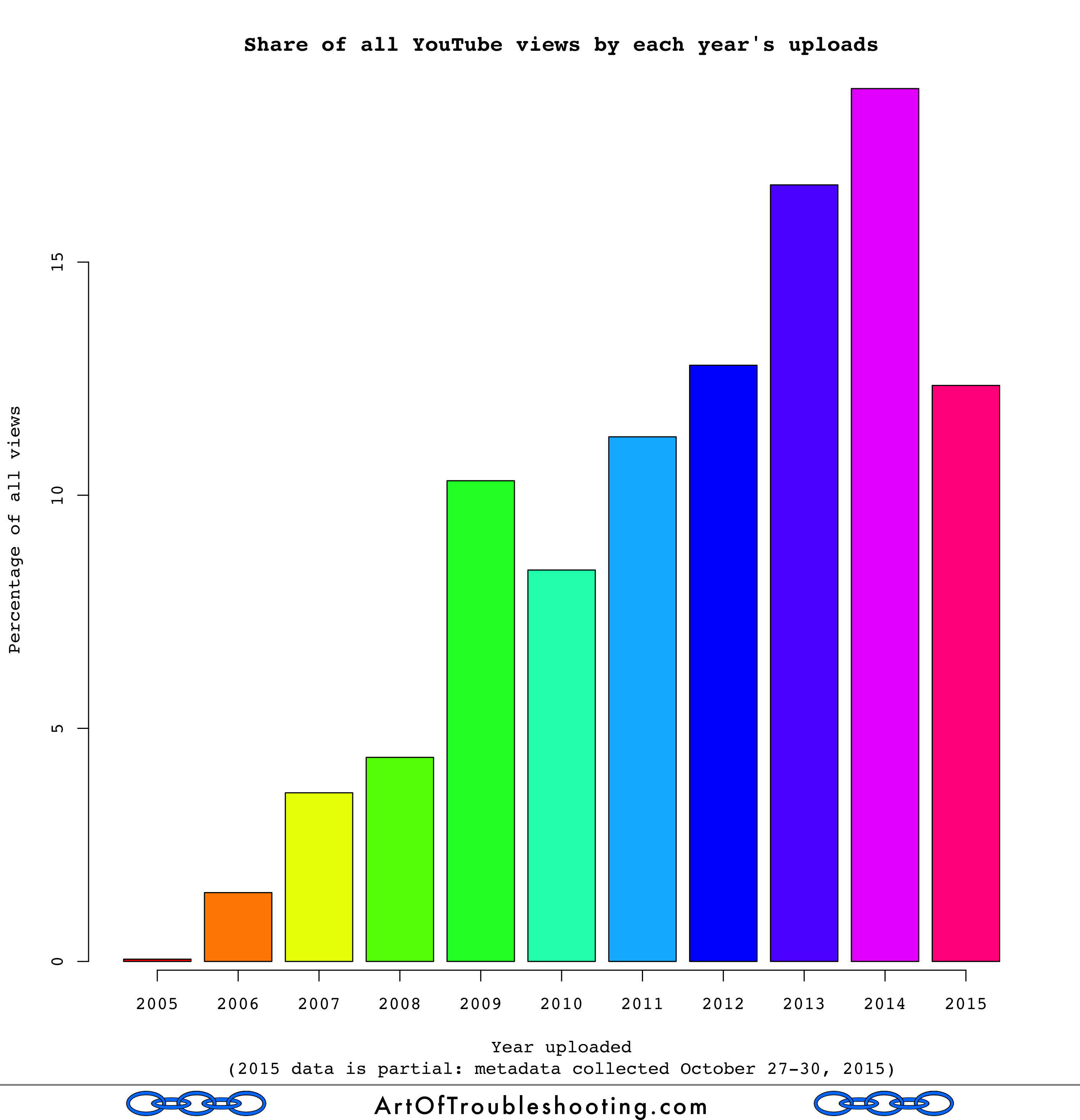
This chart is fascinating and counterintuitive. Why would 2009’s videos have more views that 2010’s? Did they turn out to be more popular? Likewise, we can see that 2015 is lagging behind 2014. I collected this data October 27-30, 2015, which is about 4/5 of the way through the year. If this trend holds, 2015’s videos will not surpass 2014’s in views. Of course, 2015 could eventually catch up. But then again, 2010’s videos haven’t yet surpassed 2009’s.
Feel free to speculate about this finding in the comments section below: it would be great to hear various theories as to why this could be true. This result definitely violates my expectations: I would anticipate YouTube’s usage to be at its zenith, and for most videos to be watched shortly after they are uploaded.
The chart with uploads by year shows that 2015 will set another record in terms of videos uploaded. Wouldn’t this correlate with usage? Perhaps not, as uploading can be completely automated, whereas viewing (if measured accurately) is dependent upon the whims of humans. It’s interesting to think about “peak YouTube” with respect to views: it has to happen eventually. Perhaps 2014 was that summit and now other pleasant mindless distractions will come to the forefront?
The ratio between the number of videos and the eyeballs watching them has undoubtedly changed over the course of YouTube’s history. While both of these measures have surely grown by incredible amounts, it would be unreasonable to assume they have grown at the same rate. As a global phenomenon, YouTube will eventually reach saturation. Compilations of cute cats are curiously compelling, but alas there are only 24 hours in a day to watch them. Eventually, YouTube’s growth rate for viewers will settle down and track slower-rising demographic statistics like Internet penetration and population growth.
I stumbled upon this idea when I was looking at this graph:

That’s weird…why is the average number of views per video falling over time? This seems counterintuitive when you consider the previous graph that shows each successive year’s videos commanding an ever-increasing percentage of views (exceptions: 2010 and 2015). My theory is that a relatively slower-growing amount of viewing is being distributed over a pool of videos that is growing at a much faster rate. If that were true, it’s entirely possible for this downward trend in average views to occur, even if viewing and uploading are each at their high-water marks! As previously noted, the viewing data I collected is all-time and so I can’t break it down by year. Thus, this will have to remain just a theory.
Measuring interest: what are we (not) watching?
Now, let’s look at some statistics for the ways that videos can be popular. There’s obviously the number of times a video is watched, but YouTube gives you additional ways to express how you feel about content. Among these are are “likes,” “dislikes,” and comments people can leave on a video’s page. Let’s look at some basic descriptive statistics for these measures of popularity:
| Measuring popularity of YouTube videos: descriptive statistics | |||||
| Measure | Mode (% of videos or channels) | Minimum | Median | Mean | Maximum |
| Views | 0 (1.33%) | 0 | 351 | 39,987 | 2,440,349,198 |
| Channel Views | 0 (0.65%) | 0 | 476 | 87,618 | 3,939,621,394 |
| Likes | 0 (33.73%) | 0 | 2 | 198 | 9,978,570 |
| Dislikes | 0 (71.77%) | 0 | 0 | 11 | 1,372,424 |
| Comments | 0 (58.77%) | 0 | 0 | 32 | 4,974,275 |
| Data collected October 27-30, 2015 | |||||
First, let’s remark on the mode (the most frequently occurring observation) for views in the sample: it’s a big fat zero. That’s right, there’s a whole bunch of videos on YouTube that have never been watched! When I was discussing this study with others, this was by far the most surprising statistic. However, the reason why the mode is zero is straightforward: it’s very easy to upload a whole bunch of videos, watch only a few, and then forget about the rest. Further, uploading is also a function provided by the API, so it’s possible to completely automate the publishing of videos. Given that cameras can likewise be networked and have their contents downloaded automatically, it’s possible to create an entire video distribution workflow that is never seen by a human eye.
Zero, as the most common number of views, likely applies to all videos ever made, whether on YouTube or not. Think about all the cameras in operation today: how many surveillance cameras are out there, recording 24/7, churning out hours and hours of boring footage? A lot. Who watches all this video we’re creating? The answer is often—nobody! I’ve frequently taken videos with my phone camera, only to delete them later with little fanfare—even I, the creator, didn’t watch them. By the way, this reminds me of all the times I’ve seen tourists ruthlessly documenting their trips with a video camera. I once saw someone recording every second of a sightseeing boat cruise that lasted several hours and thought to myself, “Who is going to watch that?” Now I have the answer: it’s likely that no one did. I suppose there’s something philosophical to say about this as well: most moments in our lives pass with neither remark nor remembrance. Given how banal most videos are, I guess it’s to be expected that our viewing patterns are a reflection of the content.
It’s heartening to see that “liking” is used much more than “disliking.” I guess it’s Thumper’s Law in action: “If you can’t say something nice, don’t say nothing at all.” Like the reams of unwatched videos, most videos are similarly given no feedback, positive or negative. The mode for likes, dislikes, and comments are all a big goose egg. However, looking at the “maximum” column, you can see that there are some videos that are very well watched, with huge numbers of likes, dislikes, and comments.
How popular is my video or channel?
I recently posted my first public video to YouTube and it has 107 views as of today. The question “How does my video rank?” naturally popped into my head while conducting this study. I’m sure others are likewise curious about the relative popularity of their content, so I created this percentile chart for video and channel views:
| Popularity: YouTube video and channel views by percentile | ||
| Percentile | # of video views | # of channel views |
| 10% | 16 | 22 |
| 20% | 48 | 62 |
| 30% | 101 | 130 |
| 40% | 191 | 250 |
| 50% | 351 | 476 |
| 60% | 644 | 880 |
| 70% | 1,235 | 1,798 |
| 80% | 2,916 | 4,600 |
| 90% | 11,197 | 19,567 |
| 91% | 13,533 | 23,923 |
| 92% | 16,635 | 29,829 |
| 93% | 20,916 | 38,056 |
| 94% | 27,049 | 49,748 |
| 95% | 36,336 | 67,656 |
| 96% | 51,380 | 96,927 |
| 97% | 78,895 | 150,397 |
| 98% | 139,614 | 268,817 |
| 99% | 344,532 | 670,042 |
| Data collected October 27-30, 2015 | ||
I guess my video is doing okay, although it has quite a mountain to climb before it enters the top 10%. For all you content creators out there, this gives you something to shoot for!
There’s lopsided interest…but is it the Power Law?
We’ve already seen that the measures of popularity are very lopsided: most videos have a relatively small number of views/likes/dislikes/comments, while a few are famous beyond belief. As I said in the introduction, my hunch was that the outsized interest in the top videos would mean that the Power Law would be lurking everywhere in this dataset. To begin that investigation, I graphed the videos and channels in the dataset, ranked by their associated number of views, from most to least (e.g., #1 had more views than #2, #2 had more than #3, etc.):
![]()
I decided to add channels to the above plot because every video is associated with a channel (basically, a fancy name for a group of videos), and therefore every view is also credited to a particular channel. My expectation was that the distribution of views among the channels would be even more top-heavy. That is, if you liked one video by a Korean rapper dressed in a tuxedo, you’d be primed to seek out more of the same. Of course, YouTube makes it very easy to do exactly this: “related” videos, often in the same channel, are temptingly strewn about the page. Be careful, you can easily lose days of your life by following these suggestions.
With this mechanism, it’s straightforward to see how popularity can build upon itself. This spillover effect can easily be seen with PSY’s channel: while Gangnam Style may be the most popular video of all time on YouTube, nearly every other video he’s released is also in the top 1% of views as well. But when it comes to channels, let’s not forget the scene at the bottom: like videos, many channels also have zero views!
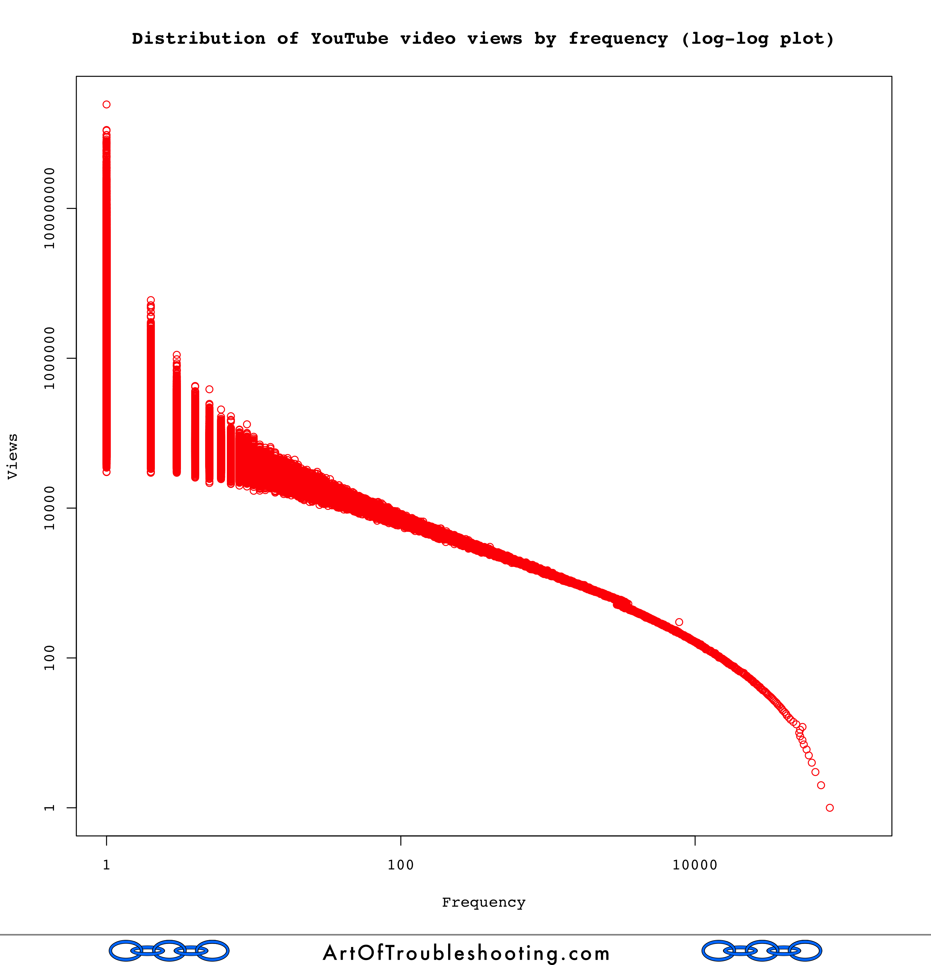
Another common way to visualize a skewed distribution is to plot the frequency of the magnitudes found in the sample. Again, we can see that videos with a relatively small number of views are very common in the sample:
Based on the summary statistics I calculated for likes, dislikes, and comments, it wasn’t a stretch that these were also lopsided distributions. So, I graphed all them together, to create a “long tail” extravaganza:
![]()
When I was reading about the Power Law, I came across these two interesting articles: “Not every long tail is power law!” and “So You Think You Have a Power Law — Well Isn’t That Special?” This stuff is far outside my area of expertise, but I think I get the gist: not every lopsided distribution indicates the presence of the Power Law relationship. Reading over these arguments, I was prompted to:
Ask yourself whether you really care. Maybe you don’t. A lot of the time, we think, all that’s genuinely important is that the tail is heavy, and it doesn’t really matter whether it decays linearly in the log of the variable (power law) or quadratically (log-normal) or something else.
Cosma Shalizi, “So You Think You Have a Power Law…”
Good question. Why did I care about the Power Law? Originally, I simply wanted to understand the popularity of Gangnam Style (as if that whole horsey dance thing could be explained logically). The Power Law was just one of those memes floating around that seemed to explain the relationship of these mega-hits to all those unwatched videos. However, I didn’t want to call it the Power Law if it wasn’t true. Apparently, it seems like some scientists feel that the Power Law is a bit like the Sasquatch, and they are tired of all the stories about how “I saw him once!”
For some, this has gone well past mere annoyance, leading to the writing of how-tos and even software to detect the presence of the Power Law. Along these lines, I found the excellent poweRlaw package for R, which helps you fit data to a variety of distribution types. One of the main points raised in the documentation is that the Power Law can be fit to any distribution. Therefore, you also need to compare it to other options, with the idea being that one of the others (log-normal, exponential, etc.) might be a better match for the data.
To do this in an objective manner, the software allows you to pit two different distributions against each other, in a cage match of epic mathiness. The referee, if you will, is Vuong’s closeness test, which gives a numerical result indicating if either distribution is a better fit. From what I read, the Power Law is often confused with the log-normal distribution, so I decided to vet that one first. Here’s the fit of these two distribution types for views: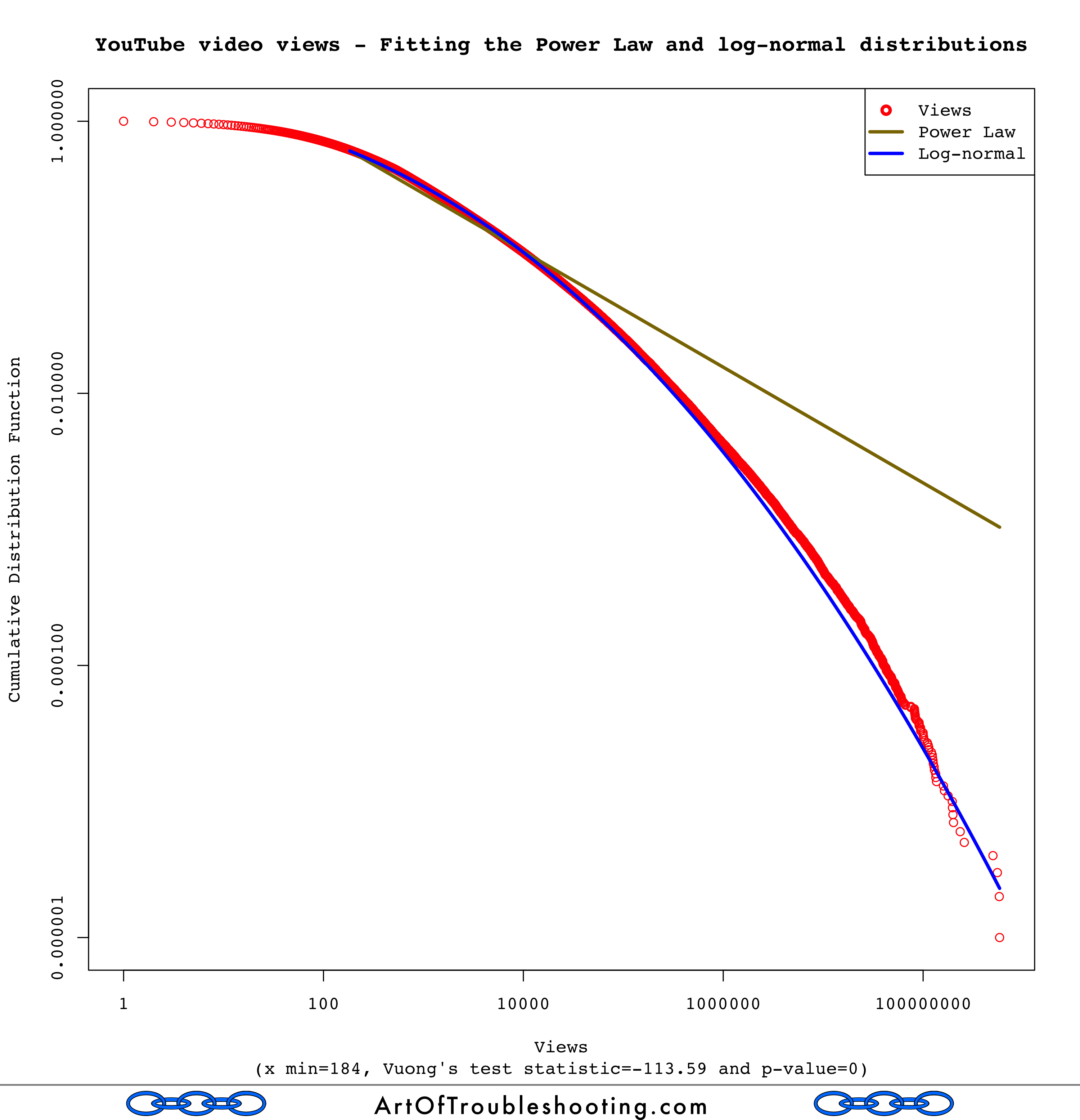
I printed out Vuong’s test statistic and p-value on the graph. The two hypotheses being tested are:
H0: Both distributions are equally far from the true distribution
H1: One of the test distributions is closer to the true distribution.
My understanding is that a low p-value allows you to reject H0. For views, the p-value was zero, meaning that one of the distributions was a better fit. To determine which one, you look at the sign of the test statistic (positive favors the Power Law, negative favors log-normal). At -113.59, log-normal is the clear winner. What about the fit for likes, dislikes, and comments?
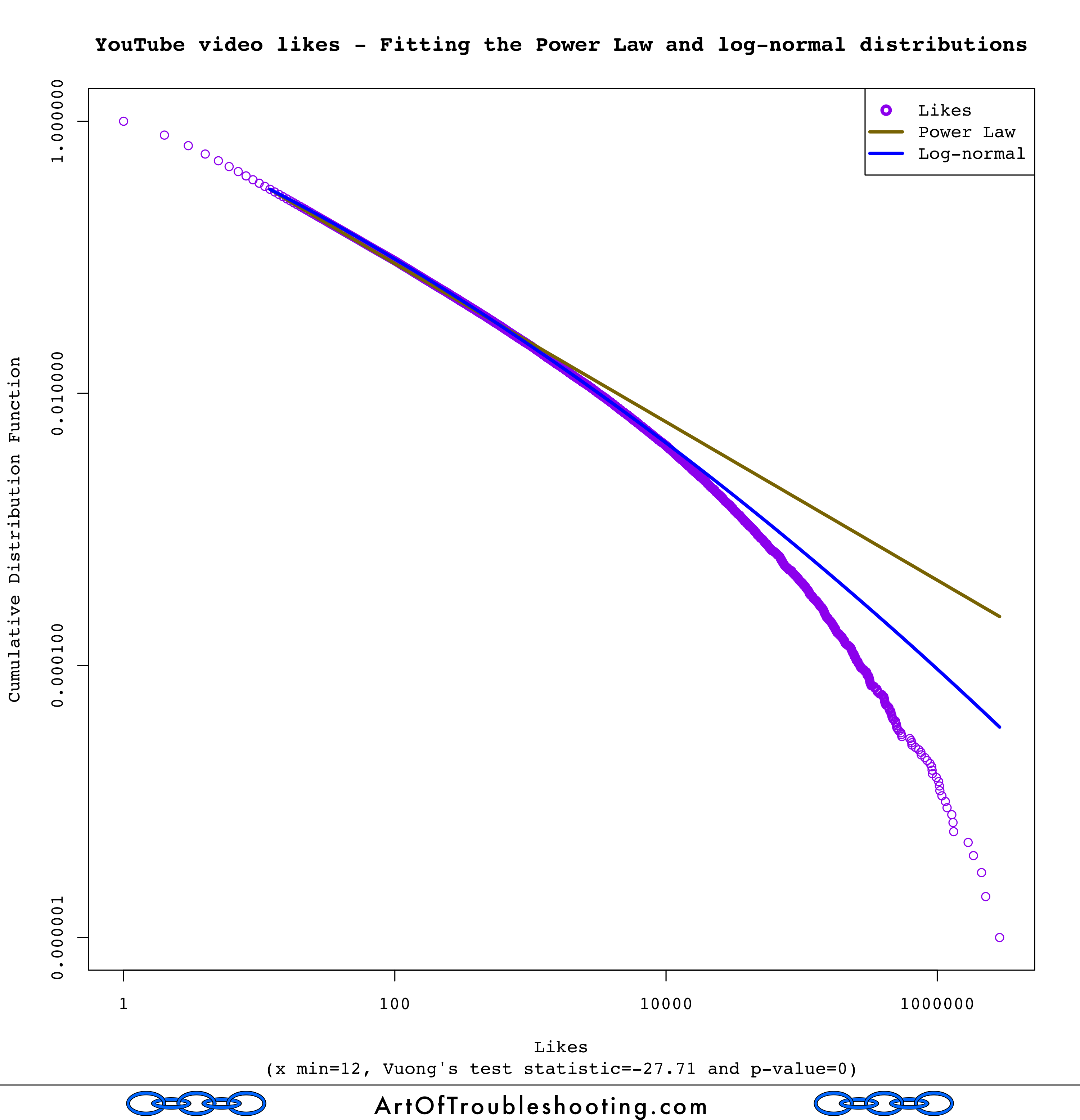
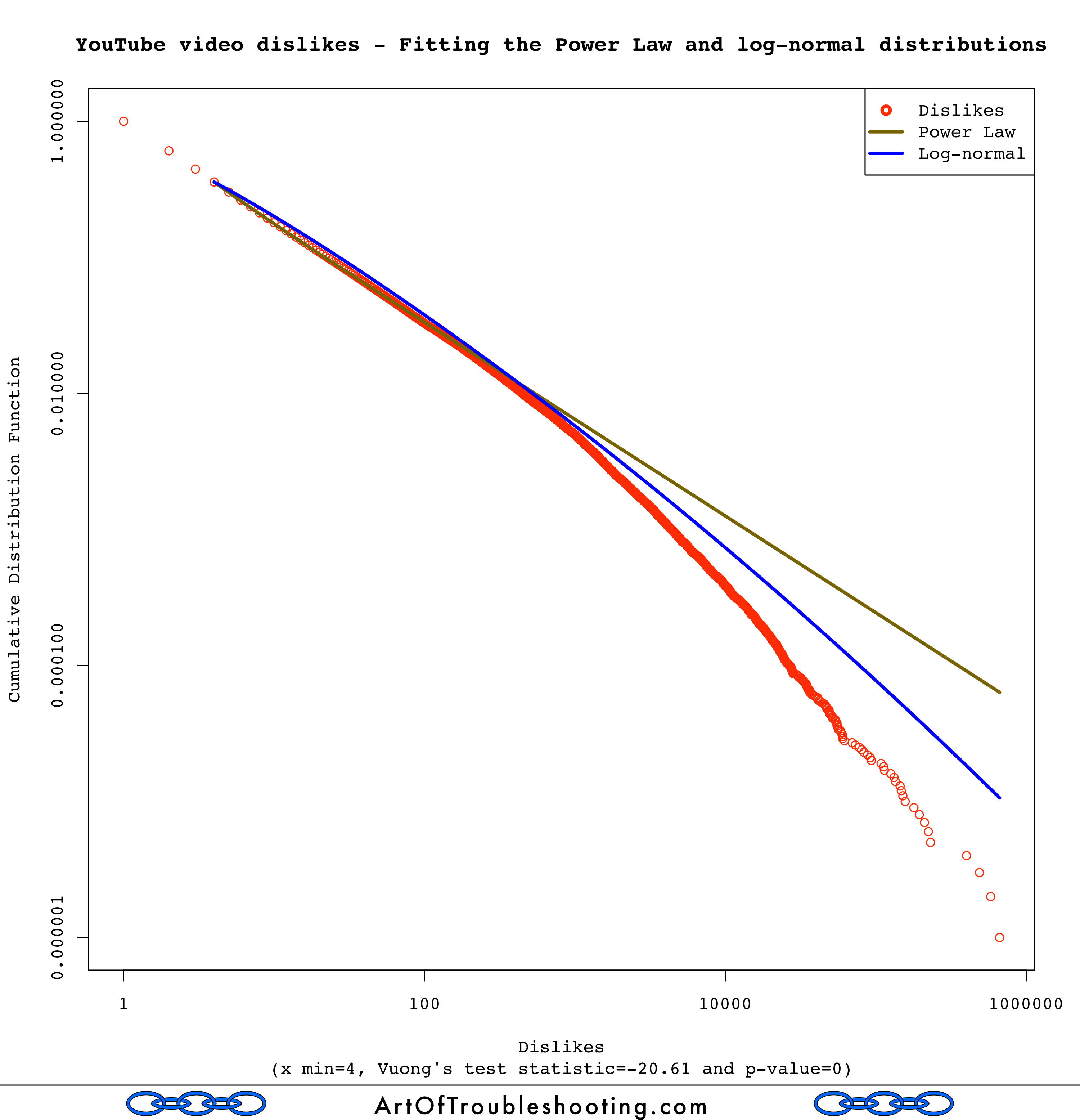
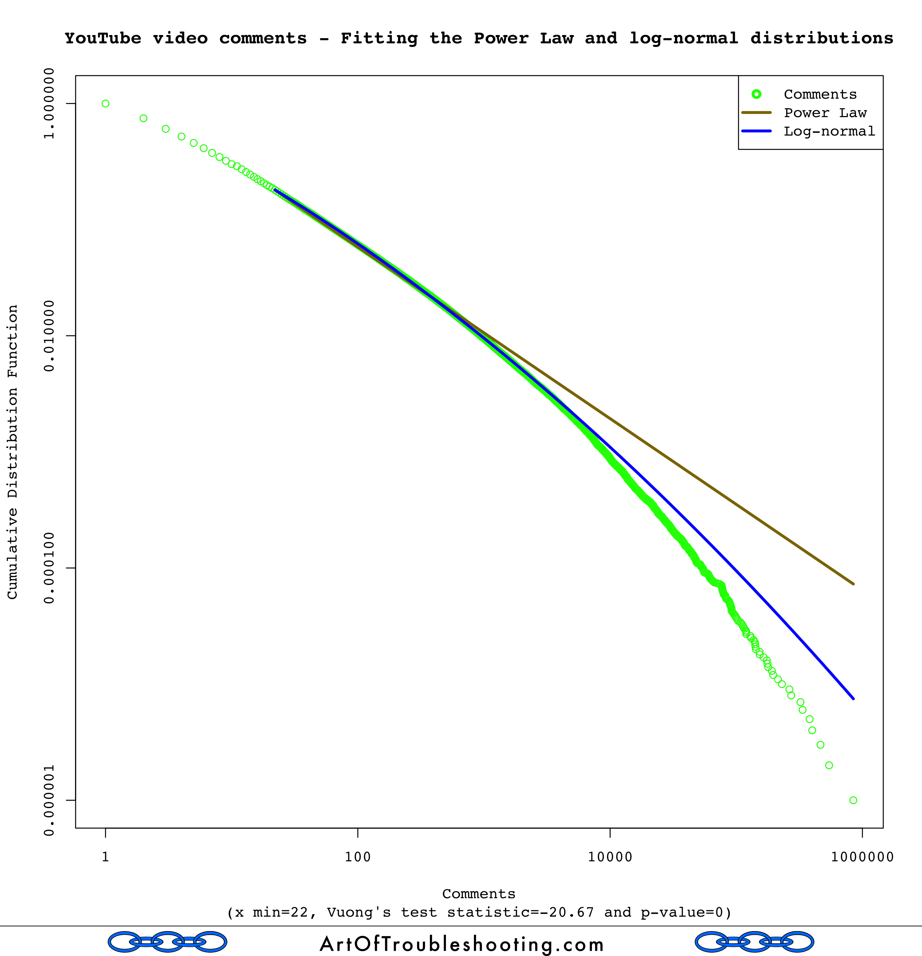
All of these tests had low p-values: again, this means that either the Power Law or log-normal was a better match. Looking at the sign of the test statistic, in every case, the log-normal distribution was considered a better fit! Here’s a table with all of the results for Vuong’s test:
| Testing fitness: the Power Law vs log-normal | |||
| Measure | Vuong’s test statistic | p-value | Closer distribution |
| Views | -113.59 | 0 | Log-normal |
| Likes | -27.71 | 0 | Log-normal |
| Dislikes | -20.61 | 0 | Log-normal |
| Comments | -20.67 | 0 | Log-normal |
| Data collected October 27-30, 2015 | |||
“Essentially, all models are wrong, but some are useful.”
George Box
Well, la de frickin’ da. So YouTube views, likes, dislikes, and comments were better described by the log-normal distribution. But, what does that mean? Before embarking on this study, I knew a bit about the Power Law, but I had never even heard of the log-normal distribution. To begin my education, I read an excellent paper on the topic called “Log-normal Distributions across the Sciences: Keys and Clues.” Limpert, et al, give a great overview of how the distribution is constructed and visualized with physical analogies (check out the neat Pachinko-inspired model that uses marbles).
The log-normal distribution is found when measuring a wide-ranging number of phenomena, both natural and man-made: the abundance of species, the pace of communicable epidemics, rainfall, income, and city sizes (although there seems to be a healthy debate in the literature about this last one). I found this passage to be particularly useful to my understanding:
What is the difference between normal and log-normal variability? Both forms of variability are based on a variety of forces acting independently of one another. A major difference, however, is that the effects can be additive or multiplicative, thus leading to normal or log-normal distributions, respectively.
Some basic principles of additive and multiplicative effects can easily be demonstrated with the help of two ordinary dice with sides numbered from 1 to 6. Adding the two numbers,which is the principle of most games, leads to values from 2 to 12, with a mean of 7, and a symmetrical frequency distribution. The total range can be described as 7 plus or minus 5 (that is, 7 ± 5) where, in this case, 5 is not the standard deviation. Multiplying the two numbers, however, leads to values between 1 and 36 with a highly skewed distribution.The total variability can be described as 6 multiplied or divided by 6 (or 6 × / 6). In this case, the symmetry has moved to the multiplicative level.
Although these examples are neither normal nor log-normal distributions, they do clearly indicate that additive and multiplicative effects give rise to different distributions.
“Log-normal Distributions across the Sciences: Keys and Clues”
I began to consider the multiplicative effects that might influence the popularity of YouTube videos. I immediately thought of Gangnam Style, which was a perfect storm of multiple multipliers:
- The overall rise of K-pop: it’s easier to promote and talk about something which is already on the public’s mind.
- The use of celebrity cameos: guest appearances in the video exploited existing fan networks, which are themselves potential multipliers.
- Controversy: the kind which gets people discussing something. Is this really best video ever? Did PSY copy dance moves from another group?
- Advertising.
- Press coverage.
- Word-of-mouth.
- Social media sharing.
Of course, I’m sure many other creators have gone down these exact same avenues to promote their work (albeit with lesser results). There’s a wide variation in the effectiveness of these components: they often work in unison and are either helped or hindered by the fickle winds of chance. Breaking it down like this, it’s easy to see how these multiplicative effects can combine together to create a mega-hit. It’s also easy to see how their absence results in all those lonely unwatched videos.
To close out this section, I calculated the geometric mean and geometric standard deviation of all the measures of popularity (note: zero values removed, see my methodology notes):
| Measure | Geometric Mean (x̄*) | Geometric Standard Deviation (s*) |
| Views | 419.06 | 12.56 |
| Channel Views | 584.14 | 14.03 |
| Likes | 7.17 | 6.40 |
| Dislikes | 3.20 | 4.13 |
| Comments | 5.39 | 5.11 |
| Data collected October 27-30, 2015 | ||
I did this so you can compare x̄* and s* to the other examples of the log-normal distribution given in the Limpert paper. Among the many examples from nature identified therein, the “species abundance” section looks the most similar, with s* values listed as being between 5.66-33.15.
The poweRlaw routines said these YouTube popularity measures were closer to the log-normal distribution, but I wanted to see it visually. To do this, I used R to calculate the logarithm of the various data points, then made a histogram showing their frequency. Here’s the graph of log(views), overlaid with a fitted normal curve:
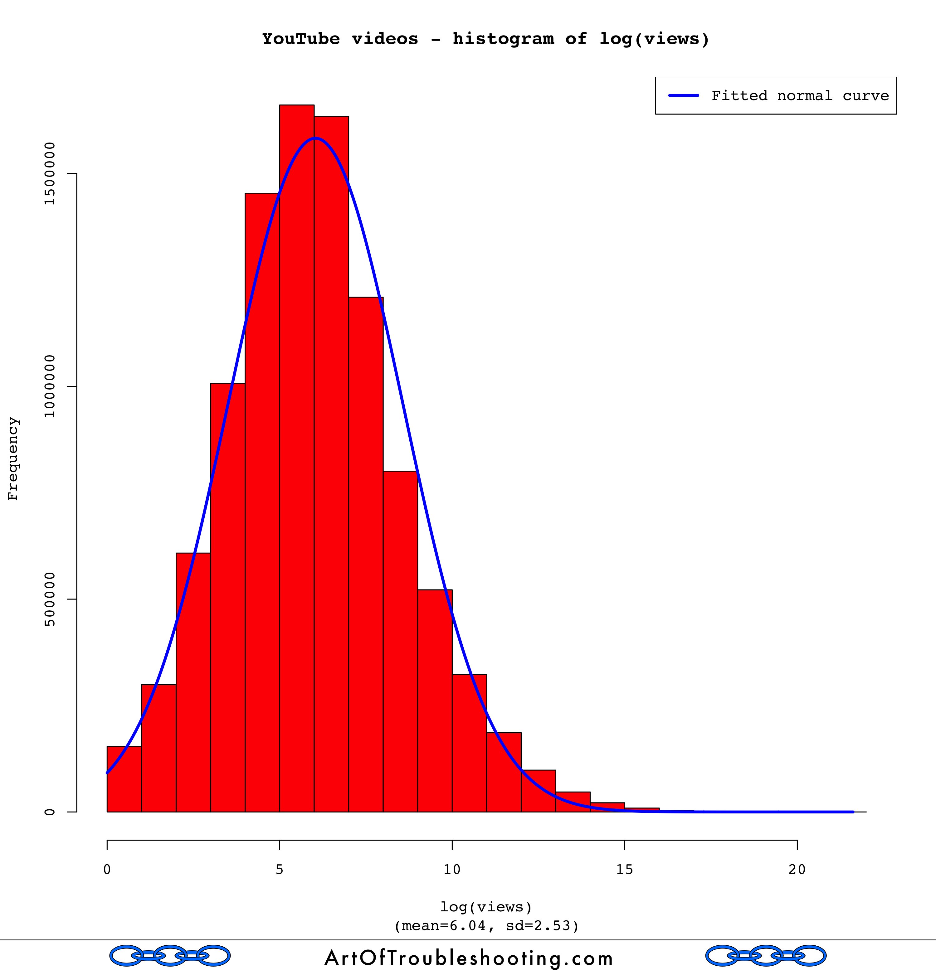
That definitely looks like a bell curve! I was now a believer that YouTube views were distributed log-normally. How about the rest of the popularity measures?
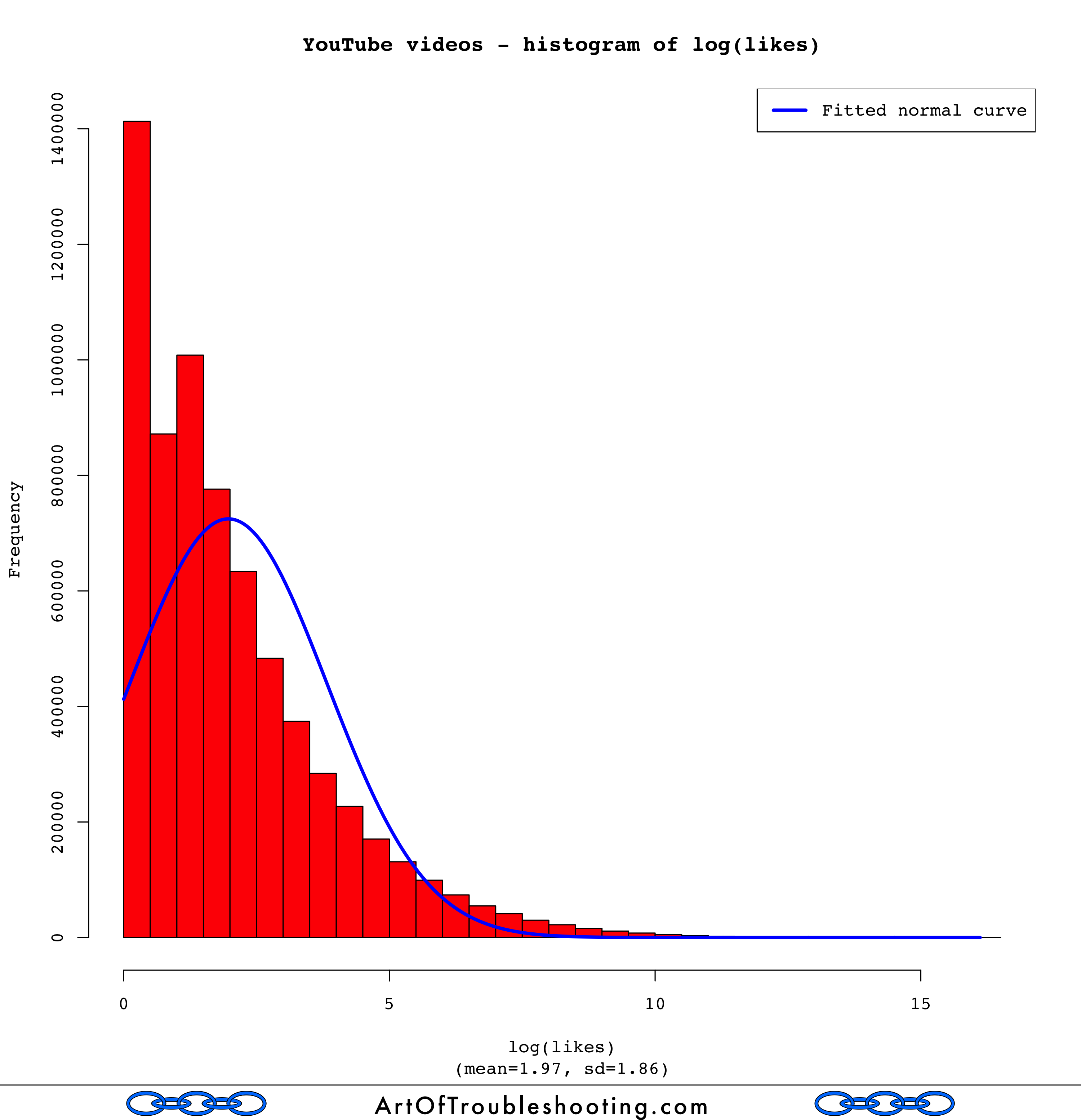
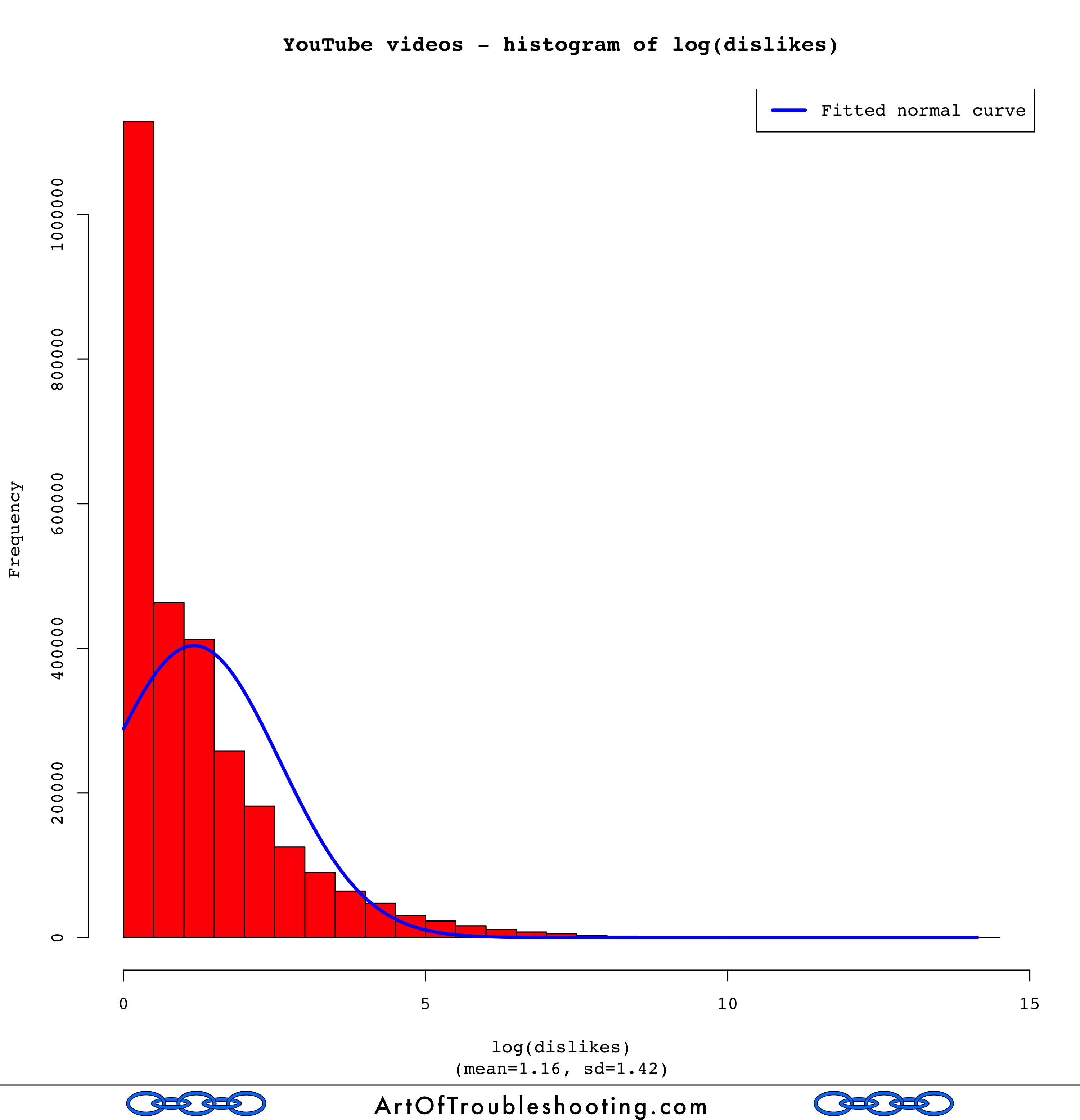
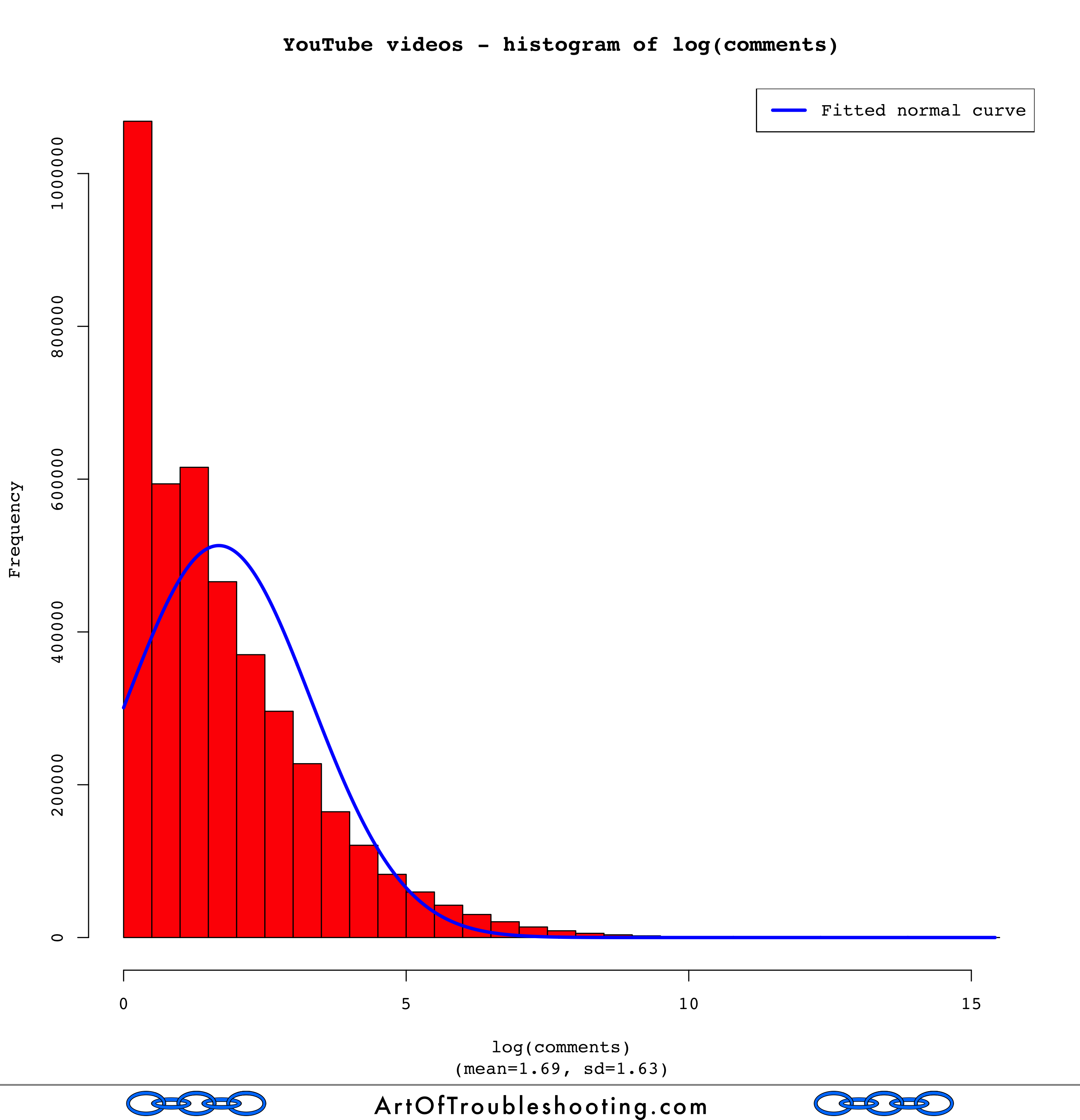
Uh oh. Those aren’t very “normal” looking. Looking back at the graphs that pitted the Power Law and the log-normal against each other, you can see that likes, dislikes, and comments didn’t track either line very well. Log-normal may have been a closer fit than the Power Law, but there’s probably an even better model for these measures.
I’m going to punt the ball away and leave this problem for a rainy day (or someone else!). Finding the best statistical model for likes, dislikes, and comments is surely an interesting problem. However, I’m not trying to do prediction or make some important decision based upon how this data is distributed. In other words, the motivation is weak.
Familiarity breeds likes and dislikes: views versus other popularity metrics
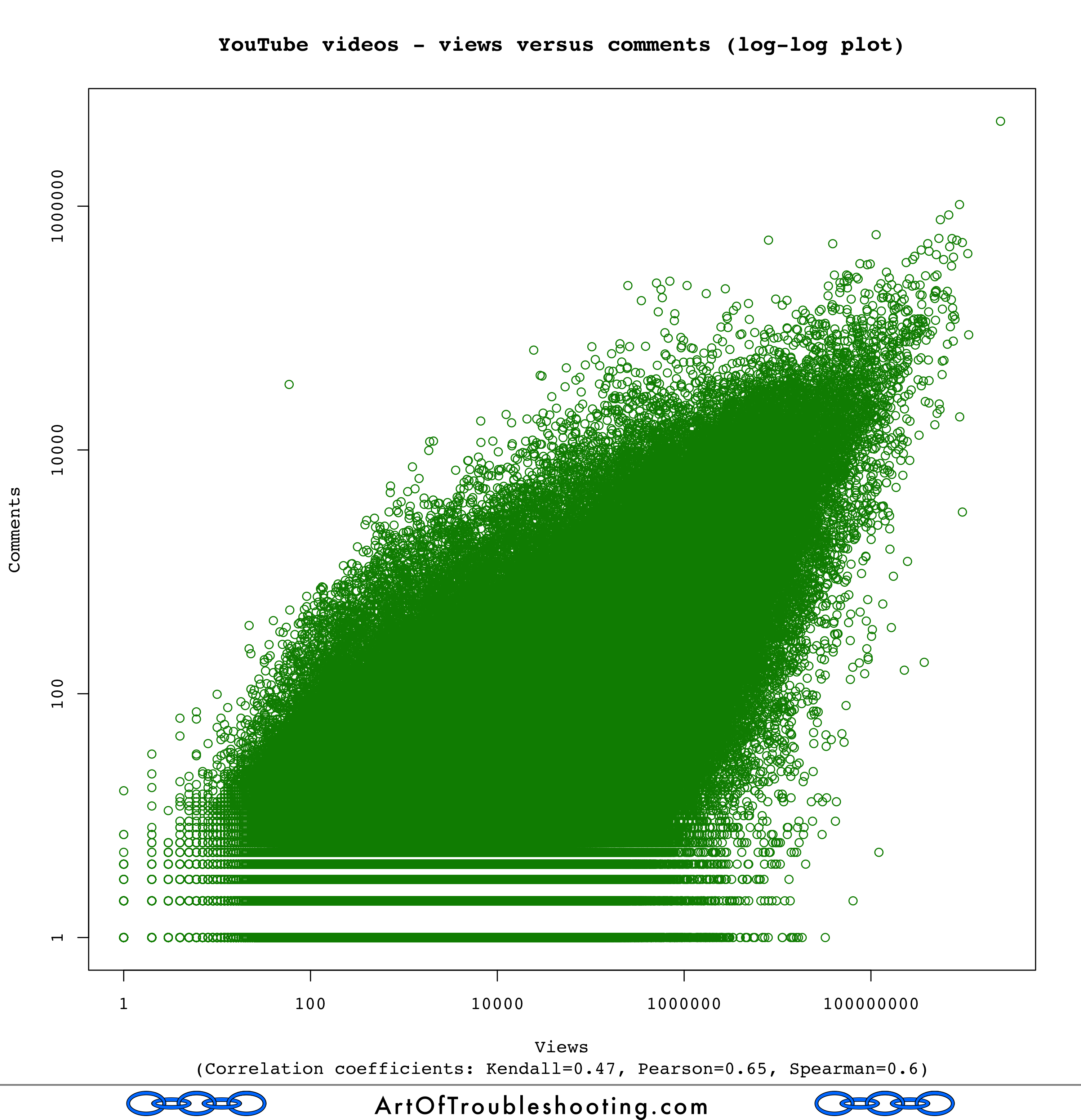
I had a vague notion that many of the measures in this dataset would be related to one another. For example, videos with more views will be more frequently liked, and vice versa. The standard caveat of “correlation doesn’t imply causation” is relevant here. But before I could self-apply this warning, I was surprised to learn that there are multiple ways to measure correlation.
That’s right, when it comes to jumping to conclusions with statistics, there are several options to fuel your flights of fancy. My journey down this path started when I spotted an apparent contradiction that I just couldn’t wrap my head around: the graph of declining average views over time clearly showed a positive relationship between age and views. However, I just couldn’t square this with the calculated correlation coefficient between these same two variables, which was 0.01 (meaning, no relationship).
I dove into the topic and found that the standard way of calculating correlation is called the “Pearson product-moment correlation coefficient.” A mouthful, but a very useful mouthful for statisticians. The problem with using the Pearson method on my YouTube data was that it doesn’t handle the presence of outliers very well: it’s designed for distributions that look like the bell curve. Of course, the presence of huge outliers like Gangnam Style was what drew me to this project in the first place.
After further reading, I became acquainted with two additional ways of calculating correlation: the Spearman and Kendall methods. Cutting to the chase, the gist (from my amateur viewpoint) is that the Kendall and Spearman coefficients are much better suited to this type of data, which is not normally distributed. I added these additional correlation calculations to my graphs, and they turned up some new ways of understanding how these variables were related (or not).
Here’s a graph that shows the correlation between likes and views:
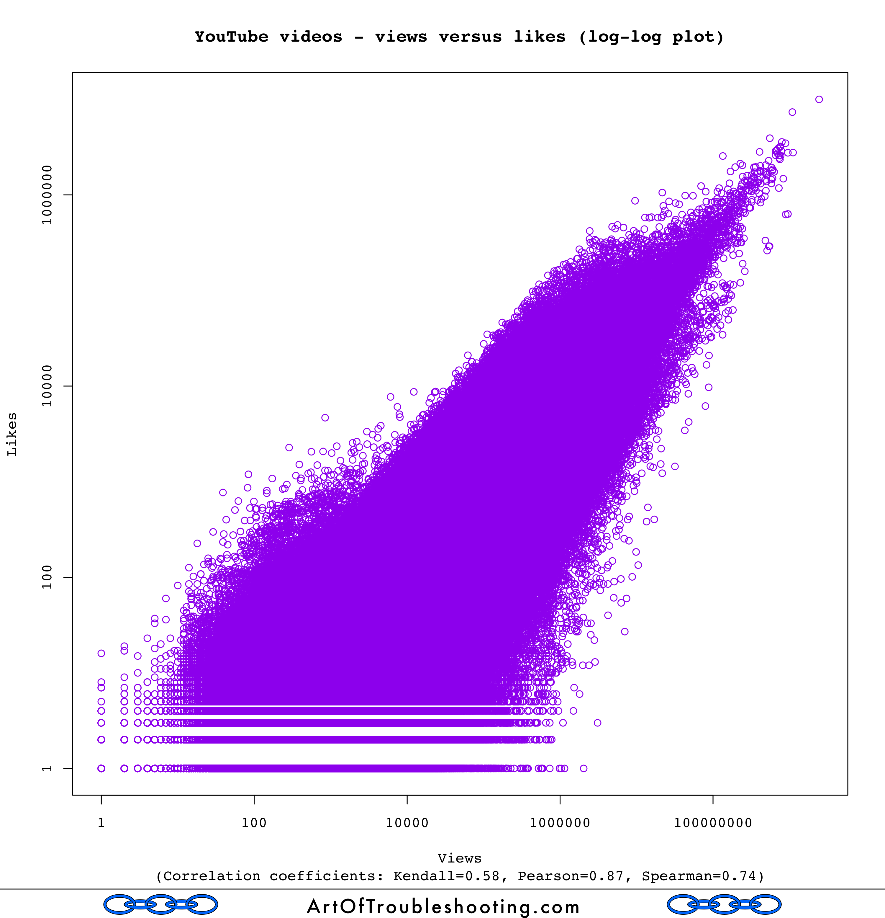
A Spearman correlation coefficient of 0.74 implies a strong relationship between likes and views. It’s easy to guess why: viewing a video is usually a prerequisite for pressing the “like” button. In fact, any action that can be taken on a video’s page will be correlated with viewing because a video usually begins playing automatically when you load the page (more on how YouTube calculates views later on in the study).
Therefore, I also had a suspicion that the same correlation would be present for views and dislikes: on YouTube, hating a video is a very active thing, you have to first find the offending content, visit its page and then finally click the thumbs down icon. Can you press the dislike button without generating a view? People may do a hit-and-run on the most disliked videos of all-time, but for those not out to pile on the misery, viewing is generally a gateway for liking, disliking, and commenting. That these actions are linked may seem obvious, but stick with me because I think there are some deeper lessons here.
The most disliked video of all time is Justin Bieber’s Baby, which also happens to be the 3rd most watched video on YouTube (see my top video lists for current rankings). I’m sure there’s something that people would hate more than this bowling alley-centered romance, it’s just that they haven’t found it yet. I’m positive the most loathsome video for your tastes is already sitting there on YouTube, it just hasn’t entered your awareness. In fact, it’s entirely plausible that no one has set eyes upon your personal bête noire: it’s out there, languishing in a dusty corner of cyberspace, likely with zero views.
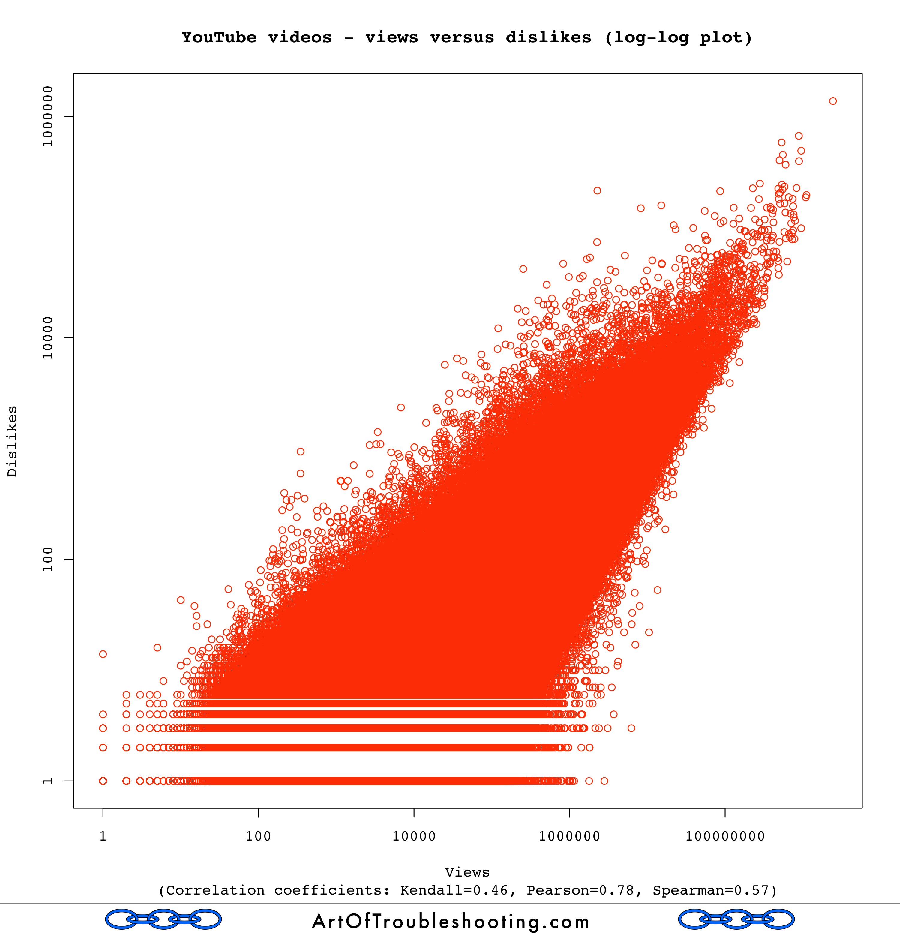
The above graph shows that dislikes are also correlated with views. The problem is that, unlike older broadcast mediums, what you watch on YouTube is highly personalized. Are people truly seeking out things which they absolutely loathe? Or, is the dislike button a weak form of disapproval not to be taken seriously? Did those who thumbed down Baby not know what they were getting into when they clicked on a video that was obviously by Justin Bieber?
That’s why dislikes on platforms like YouTube have to be taken with a grain of salt. Given the speculation that Facebook may be working on their own dislike button, we should keep in mind this relationship between views and these measures of popularity (positive and negative). In order for you to feel something about a piece of electronic media, it must first be put in front of you. But, the highly curated world of social media is a strong barrier around your range of perception. Any disliking happens on top of this filter, and is not necessarily indicative of what truly disgusts humanity.
Apparently, we also comment upon what we put in front of ourselves:
Therefore, since brevity is the soul of wit,
And tediousness the limbs and outward flourishes,
I will be brief…
Polonius
In this section, we’ll look at the duration of videos. Are the videos on YouTube just fodder for our ever-shrinking attention spans, as some cultural commentators have fretted about? Let’s look at the numbers:
| Descriptive statistics: video durations (in seconds) | ||||
| Mode | Minimum | Median | Mean | Maximum |
| 31 | 0 | 213 | 463 | 107,373 |
| Data collected October 27-30, 2015 | ||||
Okay, so the average video is 7 minutes, 43 seconds long (for the explanation of the videos that are 0 seconds long, see the section on randomness in the methodology notes). But, what about the trend in duration over time? I’ve got a graph for that too:
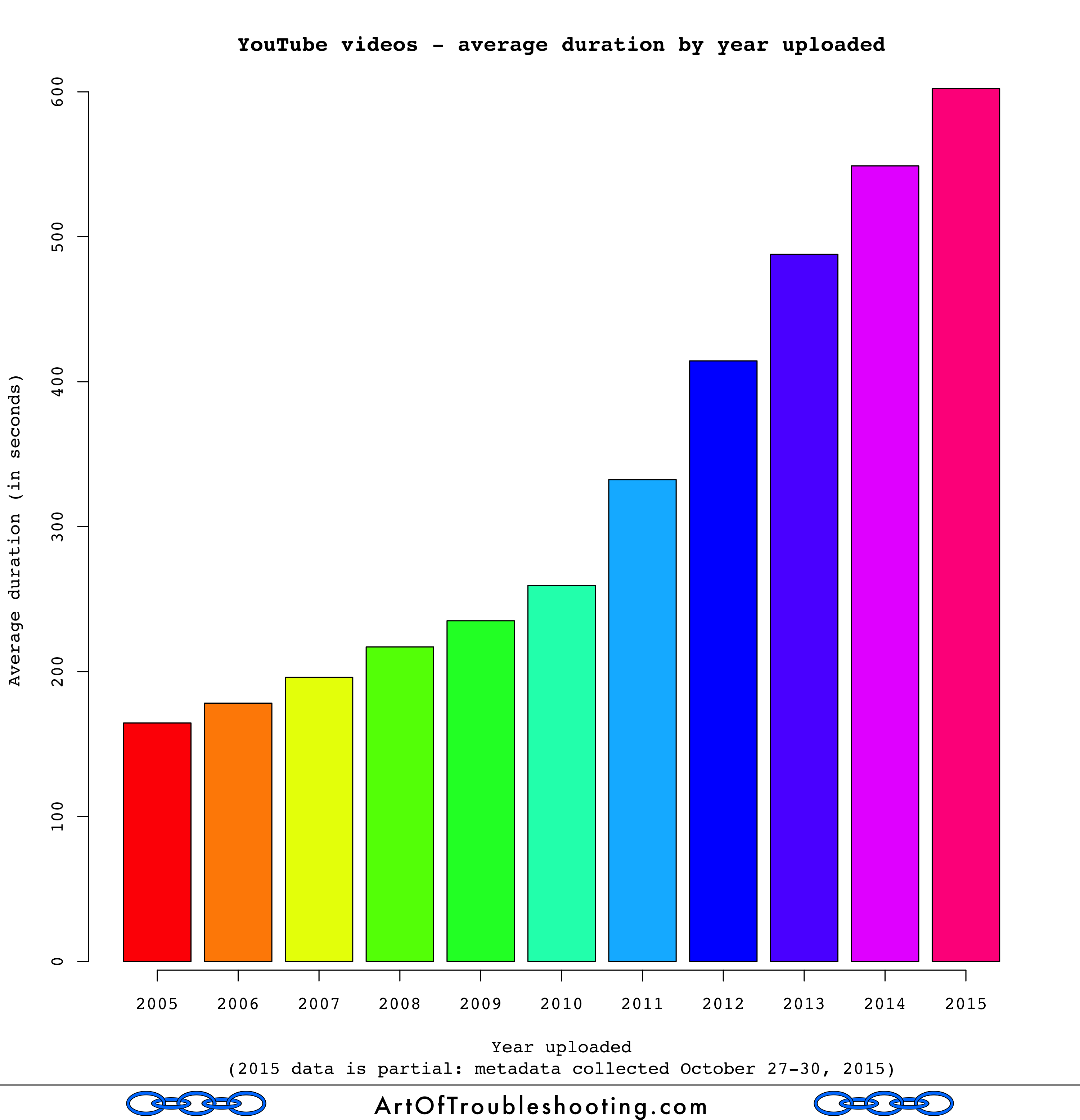
If you’re concerned about information being cut into increasingly small pieces, this should be encouraging: the videos that people are uploading are actually getting longer. But, what are people actually watching? To get a sense of this, I calculated the amount of time people spent watching each video in the panel, multiplying a video’s number of views by its duration. Then, I summed all that time spent watching videos and divided the result by the total number of views, as in this formula:
Σ (duration x views) ÷ Σ views = Average time spent watching a video
For my sample, the numbers were:
227,024,844,945,919 seconds watched ÷ 406,868,897,904 views = 558 seconds per view
558 seconds is over 9 minutes: that’s not exactly a Wagner opera, but it’s not a sound bite either. However, this statistic comes with the caveat that YouTube won’t actually say what a “view” really means. It’s not even clear if you have to get all the way through a video for it to count. In a video about view counts, a YouTube spokesman simply says that a view happens when someone “had a good user experience.”
YouTube is guarded about how it calculates views because they are the coin of the realm, so to speak, and influence how content creators get paid. Therefore, it’s not surprising that there has been a significant amount of fraud in this area, with YouTube periodically cancelling huge numbers of views that it considers to be counterfeit. By the way, these purges could account for the anomaly I noticed for videos from 2010, whose views were inexplicably down from 2009’s videos: it’s entirely possible there was view count fraud that disproportionately affected content from this timeframe.
When it comes to size, there’s one last question that I wanted to ask: is video length correlated with popularity?
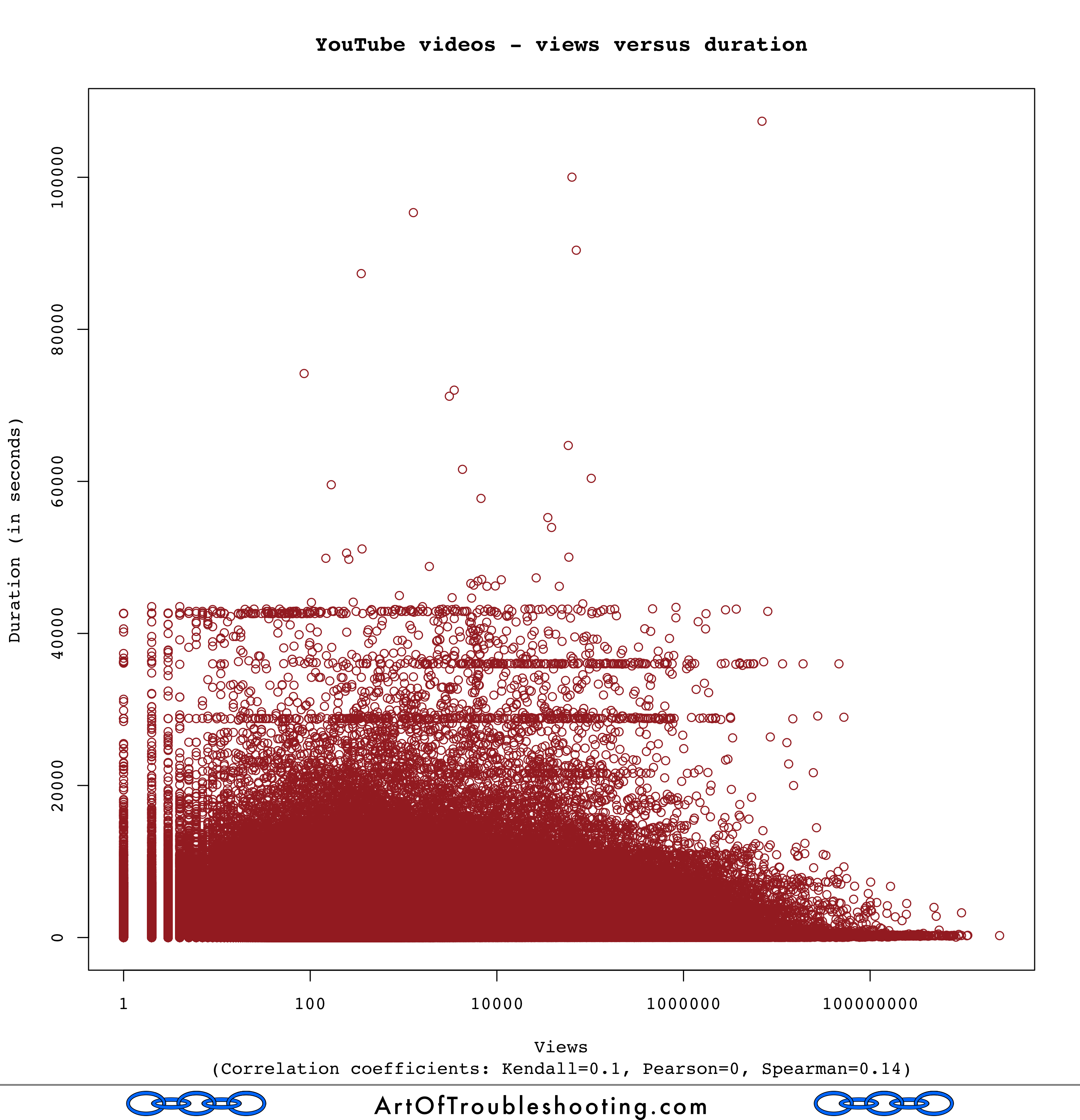
There doesn’t appear to be much of a correlation (Spearman=0.14) between video length and popularity: videos of any size are contenders for the spotlight.
Marty: The last time Tap toured America, they were booked into 10,000-seat arenas and 15,000-seat venues. And it seems that now, on the current tour, they’re being booked into 1,200-seat arenas, 1,500-seat arenas. I was just wondering, does this mean the popularity of the group is waning?
Ian: Oh, no, no, no, no, no, no…no, no, not at all. I just think that the…that their appeal is becoming more selective.
This Is Spinal Tap
Given that YouTube has been around for a decade, you may be wondering “What about the older videos on the site?” For any type of media, recency is typically a big factor in attracting an audience. From TV networks to movie theaters to radio stations to concert venues, the focus is usually on recent material.
However, there is a countertrend to this obsession with the new: sometimes it takes a long time for something to “find its audience.” There are countless examples of works that really didn’t do that well upon their debut (so-called “sleeper hits”), but then eventually found great success. One of my favorite movies, This Is Spinal Tap, only became popular after it left theaters, finding a “less selective” audience on video. Other works start out popular, then continue their winning runs indefinitely: we’ll probably be watching Sesame Street reruns and buying Elvis boxed-sets well into the 23rd century.
In YouTube’s case, all these old media patterns combine with a variety of new effects. Videos are now being shared on social media like Twitter and FaceBook, which probably favors the recent. For example, your friend’s video from a recent trip to Mexico might catch your interest in the weeks after they return. But, 5 years later it’s unlikely to get much attention (unless something exciting happened).
To make things even more complicated, all these crosscurrents are taking place within the context of YouTube’s tremendous growth during the last decade. A constant stream of new users, watching and sharing videos for the first time, should favor recent content. That’s because today there are simply more people engaged with YouTube’s platform versus 10 years ago.
How will all these factors play out? Let’s see:

The graph above is definitely a big blue blob, but it does taper slightly along the top left edge; this, along with the Spearman correlation factor of 0.4, says to me that a video’s age might be weakly correlated with views. Also, recall the graph showing the decline in average views over the years: clearly there’s some relationship between age and popularity. Extending that analysis, those older videos were placed on YouTube at a time when there was likely a different balance between viewers and videos. Fewer options combined with relatively more users gave these titles a kind of “first-mover” advantage.
To fill in the picture, here are the statistics for the age of videos on YouTube:
| Descriptive statistics: video age (in days) | ||||
| Mode | Minimum | Median | Mean | Maximum |
| 3 | 0 | 782 | 951 | 3787 |
| Data collected October 27-30, 2015 | ||||
At 951 days, the average video has been on the site for a little more than 2 ½ years.
YouTube has a category system which classifies the videos in its massive collection in 19 separate areas of interest. Which ones garner the most attention?
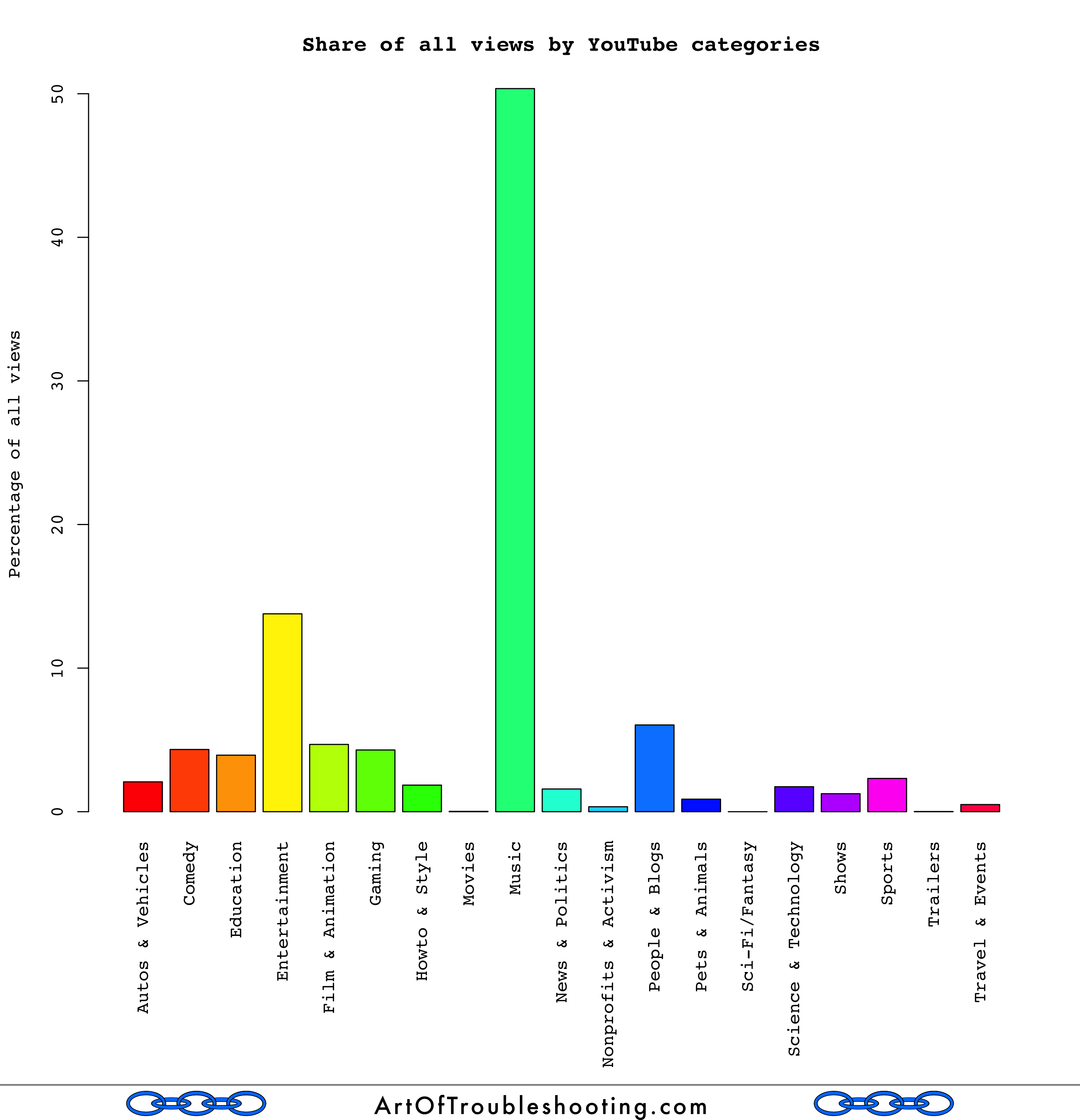
When it comes to what people watch on YouTube, you can see that there is one category that towers above the rest: music. I expected this because when I was composing the lists of top videos in each year, I made a separate set of lists with just music videos. I made the music lists because I thought they could be like those end-of-the-year countdowns that I used to listen to on the radio. When I got done with both sets and compared them, I noticed that the overlap was significant: the overall lists were composed almost entirely of music videos!
Wordiness: titles, descriptions, and tags
I want to look at some of the weirder theories I entertained while working with this data. Specifically, I became interested in how people try to make their videos appealing. When you put a video up on YouTube for public consumption, the thought enters your mind that you’re competing for the attention of the world. Therefore, choosing a catchy title, assigning relevant tags, and writing a compelling description all seem to be important. But, these promotion efforts can also be overwrought; more isn’t necessarily better. Let’s see if there is any relationship between a long-winded title and popularity:

Based on the correlation coefficients and the shape of this graph, I’d say that’s a very weak relationship. That might not be very interesting, but this chart does show something that caught my eye: a clear line forms around titles with 100 characters. My guess was that YouTube has (or had) a 100-character limit for video titles. After doing some research, I discovered that this is YouTube’s stated policy for title lengths. It’s neat when you can discover something like that visually!
Alright, so title length doesn’t mean much, but how about views versus the length of a video’s description?

You can see another line here, indicating that YouTube probably also has (or had) a limit of 5,000 characters for a video’s description. What we don’t see is a strong correlation between description length and views, with a Spearman coefficient of 0.21.
Okay. What about tags? In general, do more tags lead to more views?

Alas, there doesn’t seem to be a strong correlation between popularity and title length, description length, or tag count. I’m sure there’s plenty to learn about how to write titles and descriptions that inspire action, or how to tag videos so that searchers can find them (i.e, the content is important), but rest assured that overall the length of these metadata fields has little to do with popularity.
Things that maybe, possibly should be random: the first characters of titles versus popularity
When I had to make a choice about the sort method to use for searching, my conclusion was that ordering results by title would produce the most random results. As shown in my methodology notes, probing YouTube’s collection in this way definitely skewed the results towards the obscure (as measured by view counts). However, I still wanted to test the premise that names didn’t matter by calculating the average number of views by titles starting with A, B, C, etc. Over such a large group of videos, I wouldn’t expect there to be a big difference in the average number of views for any given initial title letter. Put another way, Star Wars starts with S, but so does the 500-megaton bomb SuperBabies 2.
Yes, I would anticipate that the total number of titles beginning with ‘S’ would vastly outnumber those beginning with ‘X’, simply because there are so many more words that begin with ‘S.’ However, without knowing the particulars, there’s no reason why a video called “Sam’s Birthday Party” would be more popular than say, “X-ray Vision Is Real.” It would depend heavily on who was invited to Sam’s shindig: did The Most Interesting Man In The World attend, or perhaps a motivational speaker? Was it filmed by a 5-year-old on a sugar high? As for the X-ray flick, what are we looking at with our X-ray goggles? Did Werner Herzog direct? Is our enhanced vision turned towards a pile of dirt, or being used to see how much gold is really in Fort Knox? Like Roger Ebert said, “it’s not what a movie is about; it’s HOW it’s about it.”
There is one more thing to account for: while collecting this data, the search results were sorted by title. This, combined with the fact you can only go the 500th result, means my sample is heavily skewed towards the beginning of the alphabet. Imagine searching for a popular term like “cats,” which will return a gazillion results. However, if you can only go the 500th result, you might not even touch a fraction of the “A’s.” Here’s a histogram of how many videos of each title letter were in the panel:
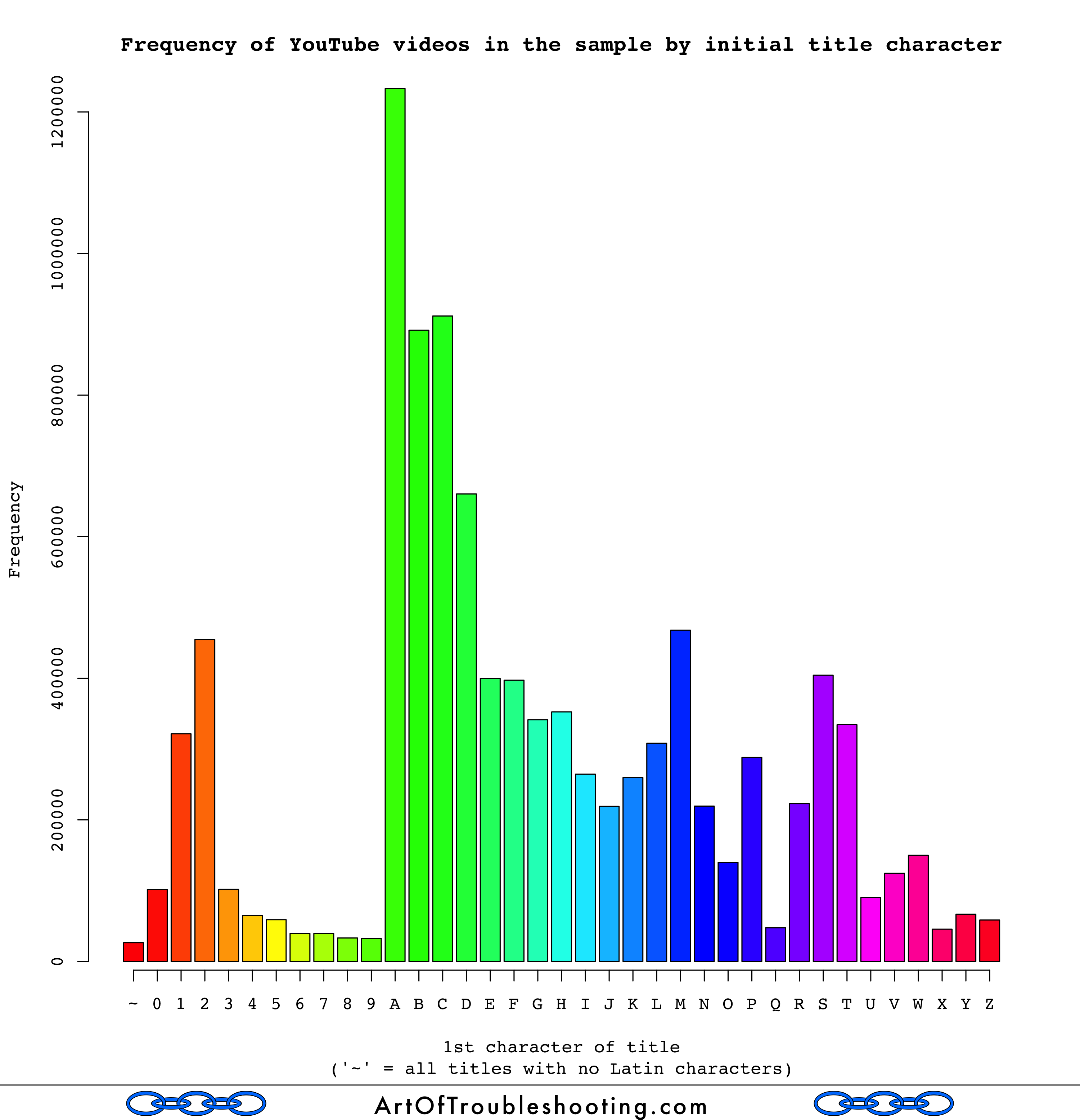
You can see that the first letters of the alphabet are overrepresented in the sample, for the reasons explained above. Given that there are some huge outliers lurking in the data, this overweighting could affect the average. To correct for this, I generated a random sample of videos, keeping the number of videos with each title letter the same. Here’s the result of that calculation:

I’m not sure that this graph supports my cause. Some of the more obscure letters did pop to the top: in English, ‘P’ and ‘J’ have a frequency of words beginning with them of 2.545% and 0.597% respectively. I guess I was hoping that each letter’s column would be about the same size, but reality said otherwise. I think the problem is that there are just too many big outliers in this data to produce a result like I want. Then again, maybe this is what random looks like after all…
TL;DR: I tortured the data, and even then it didn’t tell me what I wanted to hear.
Things that definitely should be random: YouTube video IDs
To round out the whackier part of this study, I wanted to look at the YouTube video IDs themselves. A YouTube video ID is 11 characters long, composed of A-Z, a-z, 0-9, the dash (‘-‘) and the underscore (‘_’). Here are a few examples:
98XRKr19jIE

ASO_zypdnsQ

y6Sxv-sUYtM
Taking a glance at the list of IDs, they appear to be randomly generated, perhaps with a one-way hash function. There is a security element to choosing these IDs: many people have chosen to make their videos “unlisted” and therefore only accessible if you have the ID. If valid video IDs were easily guessable (like a sequential number), you could break the anonymity of these hidden videos. Because there are 6411 possible video IDs, with a total number of videos somewhere in the low billions, being able to guess IDs assigned to videos is time-consuming (a chance of about 1 in 10,000,000,000).
If the IDs are truly random, the first character of the ID should be distributed evenly. There are 64 possible characters (-, _, 0, 1, 2, 3, 4, 5, 6, 7, 8, 9, A, B, C, D, E, F, G, H, I, J, K, L, M, N, O, P, Q, R, S, T, U, V, W, X, Y, Z, a, b, c, d, e, f, g, h, i, j, k, l, m, n, o, p, q, r, s, t, u, v, w, x, y, z), so the frequency of IDs beginning with a given character should be about 1/64th of the total. Here’s the graph you’ve all been waiting for, showing the incidence of IDs by first character within the sample:

This looks random to me: every initial character has about the same frequency.
So many cameras: where people are recording videos
Looking over the list of available metadata fields provided by the YouTube API, I was excited to see that there were several devoted to where a video was recorded. I probed the data I had collected, pleased to find that approximately 5% of the videos had location information associated with them. This was in the form of the latitude and longitude of where a particular recording had happened. With the rise of cheap GPS receivers, embedded in tablets and phones, the geotagging of video or pictures has become trivial.
When I travel, I don’t take notes about the photos I’m taking (live in the moment, I say!). However, this reluctance to document means Sherlock-level sleuthing is sometimes needed to figure out what was in each photograph when I get back home. Where and what was this monument/facade/fountain/bridge/museum/stunning vista/delicious pastry/loose livestock? I’d have to triangulate based on my itinerary, receipts, and fading memory. For a trip lasting several weeks, where I was doing sightseeing every day, it would often take considerable effort to label each photo. On recent trips, I have left my regular camera at home, choosing instead to take photos exclusively with my smartphone. Because the photos are now automatically tagged with their location information, the process of captioning my photos no longer requires detective skills worthy of CSI.
Videos are likewise being tagged, so I wanted to display those with geolocation metadata on a map. Where are people recording? The answer is—everywhere!

With all those cameras we’ve produced, new videos are being created constantly. YouTube, as a conduit for all this activity, is an always-on global platform which is receiving new content from users 24/7. Nevertheless, I wanted to see if there were any discernible patterns in when people are uploading videos. I present to you the following graphs, which show the volume of uploading in increasingly smaller time slices: months, days of the week, hours, minutes, and seconds.

The monthly graph probably seems odd: why the dip after October? My guess is that this cliff merely reflects the relentless pace of uploading: you’ll recall from the yearly graph that each year has seen a record number of videos uploaded. As long as uploading continues at this pace, any monthly graph will suffer from when it is produced. I collected this data from October 27-30, so November doesn’t include this year’s data, making it seem smaller.
Next, I want to show you how the pace of uploading varies by hour within an average week. But in order to make sense of that, let’s first look at the top countries which had videos geotagged within their borders:
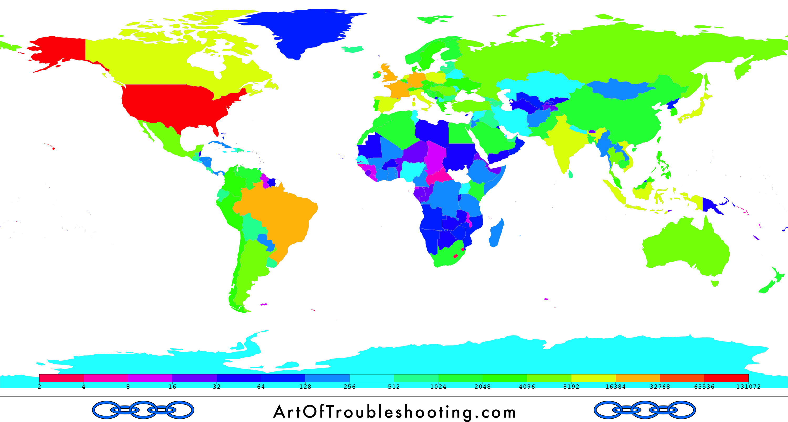
| Top 10 countries with YouTube videos geotagged within their borders | |
| Country | % of geotagged videos |
| United States of America | 25.36 |
| Germany | 5.38 |
| Brazil | 4.81 |
| United Kingdom | 4.28 |
| France | 4.08 |
| India | 3.28 |
| Italy | 3.08 |
| Spain | 2.78 |
| Canada | 2.71 |
| Poland | 2.53 |
| Data collected October 27-30, 2015 | |
If we assume these are representative of YouTube’s collection as a whole (and that most of the videos are created by residents), then the majority of uploading would likely happen when both Europe and the Americas are awake (in case you’re wondering, YouTube is blocked in China and so they have their own home-grown equivalent). Here’s a graph showing the volume of uploads by hour of the week:
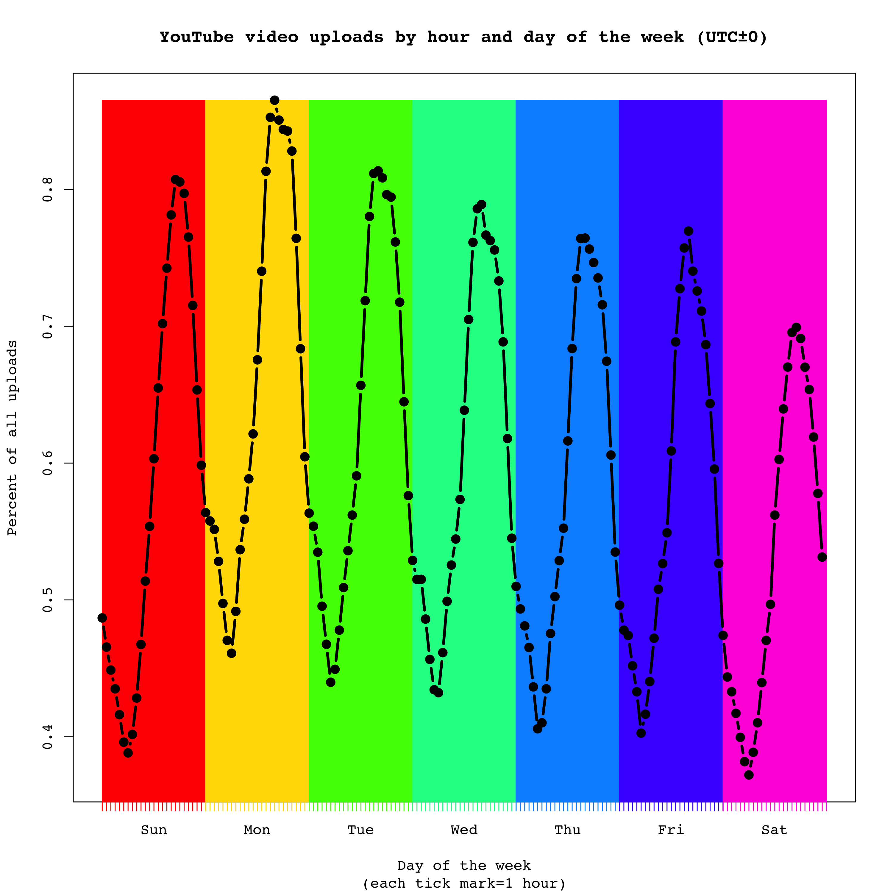
Note that the above graph is from the perspective of the UTC±0 timezone (aka, GMT). Monday is the most popular day of the week to upload. I guess people save up all the good stuff from the weekend to edit and upload at work. After all, who wants to do work while at work?
We move on to consider minutes and seconds:
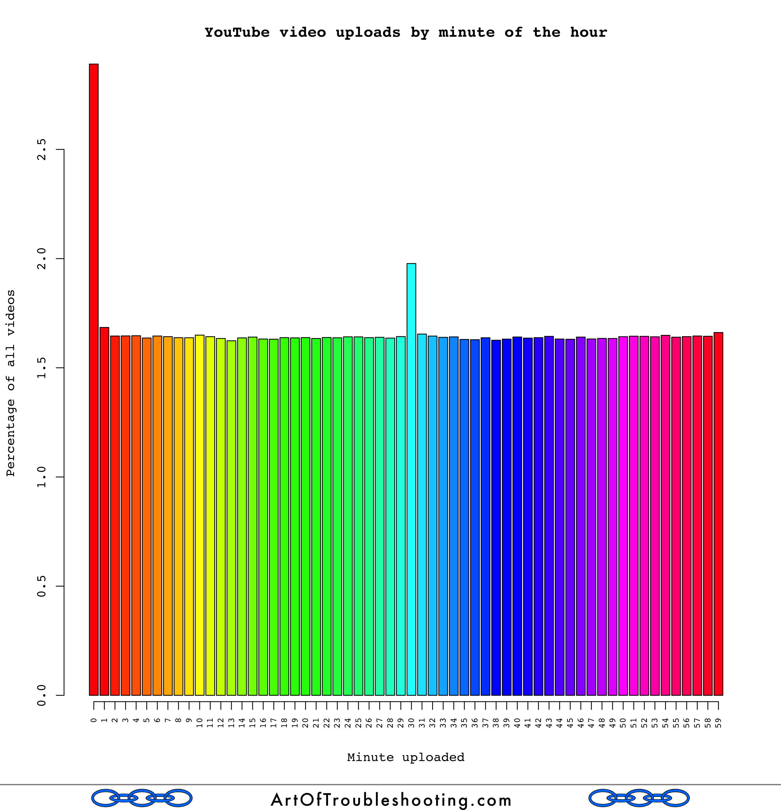
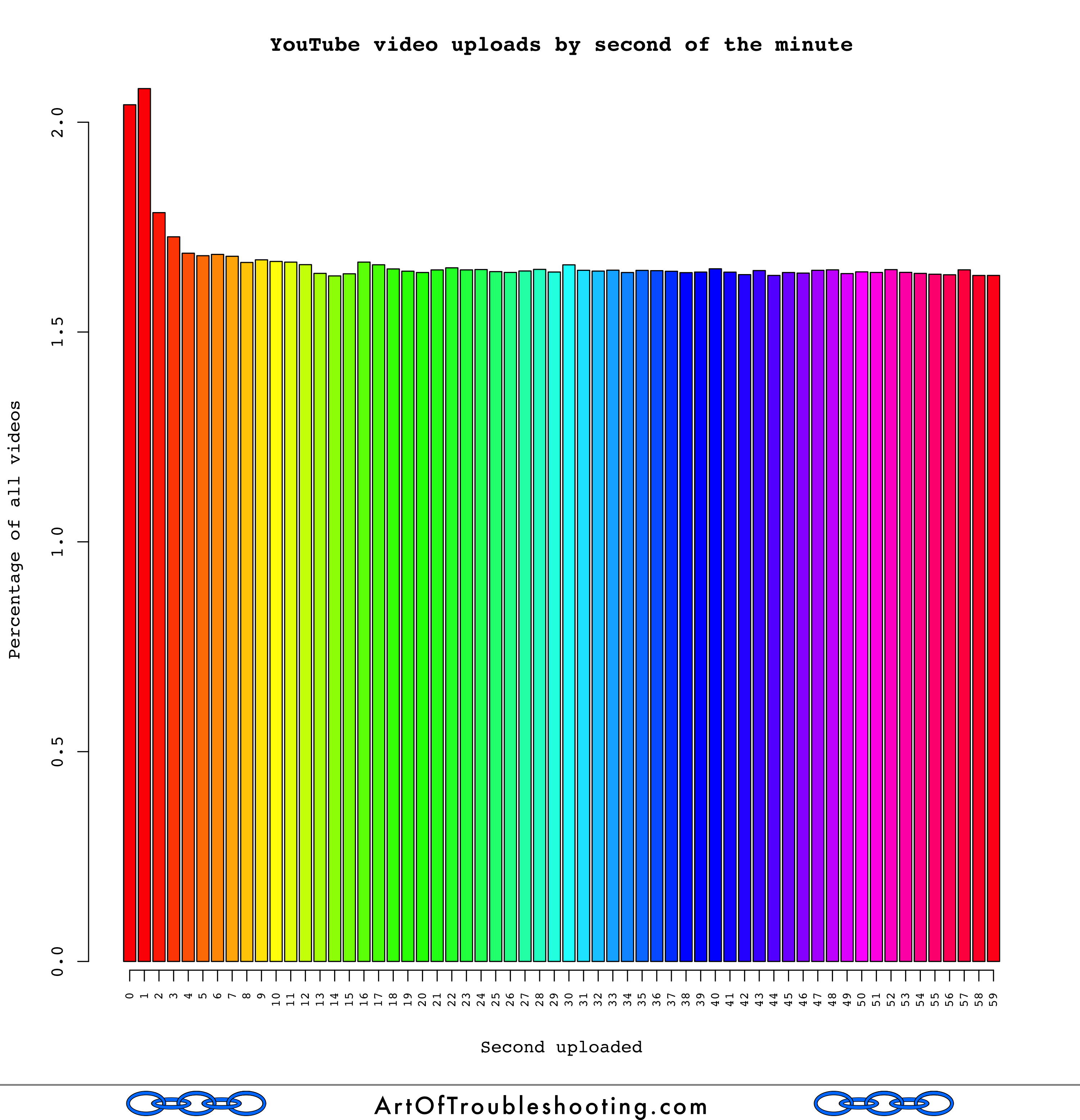
The graphs above show an interesting spike in uploads at the beginning of every hour and minute (also at the half-hour mark). My instinct tells me that these noticeable upticks show the influence of automated video publishing programs (or perhaps some kind of batch processing within YouTube’s internal systems). Especially for the seconds graph, there should be no appreciable difference between :00 and :39 in any given minute. But, the graph shows there is an appreciable rise in uploads in the first two seconds of the average minute. Most people aren’t watching the minute or second-hand when they upload, so my guess is that these anomalies are the result of scripts firing off at the top of these time periods.
Projects that were inspired by this study
Gathering and analyzing all this data sparked the following additional projects:
- Top Video Playlists: while learning the YouTube API, I compiled ranked lists of videos. I created all-time lists, as well as separate ones for each year and music videos. It’s a pop culture overdose!
- No Views: discovering that many videos have never been watched inspired me to create No Views, a place where you can watch these neglected YouTube videos. By definition, it’s a totally UNIQUE experience!
The following sections detail how I gathered and analyzed all of this data, as well my thought processes as I struggled with turning these ideas into working computer code (ruby and R code samples below are in fixed-width font). So, if you’re interested in the nitty-gritty of how this study was conducted, read on.
Methodology: Constructing the panel
When I started this project, my first question was “How do I get random videos from YouTube’s collection?” This turned out to be a difficult problem, one that others have attempted to answer with various methods (like here and here). We can’t really know how good these methods are at producing truly random videos because:
- The YouTube API is a black box.
- YouTube has a tremendous incentive to not produce “random” videos through any of its search protocols.
The YouTube dataset contains billions of objects (videos, playlists, etc.). However, the API protects its scarce resources by limiting any question asked of this massive collection to a maximum of 500 results. Allowing queries to touch every part of the infrastructure would be extraordinarily expensive, so I wouldn’t be surprised if various caches, indexes, optimizations, etc. are in place to speed up searching. These schemes are put in place to improve the quality of search results, and likely in a very specific way: to get people to watch more videos.
Put another way, because so many videos have few views, they aren’t creating advertising revenue. From the perspective of the average YouTube user, they’re not that interested in “random” videos either: they’d much rather see content that is interesting, engaging, fun, dramatic, popular, useful, etc. “Statistically representative” isn’t a search option for good reason!
Whether you can truly stick your finger into every nook and cranny of YouTube’s collection via their search API, can only be answered by the engineers and architects who work there. However, I don’t work at YouTube, so the API is really the only way to efficiently do a study of this scale. Therefore, I analyzed various search techniques, to see how “random” they were.
Methodology: More random, please
Looking at how others had solved this problem, the consensus seemed to be that throwing random search strings at the API would get you close to the ideal of “random” results. So, that’s why I tried. However, you must choose a sort method to go along with your search. The API documentation lists these as:
sort_options = ['relevance', 'date', 'title', 'rating', 'viewCount']
While my search strings were to be drawn out of the magic hat (aka, the random number generator), I wanted to see if the various sort options affected the quality of the results returned. So, I wrote a script that cycled through the various “order by” options, while searching for the same 100 random search strings:
random_strings = ["-AXN", "f2zg", "kl5r", "NYU8", "MBo1", "mReq", "Jy8D", "ZxI5", "h5Qg", "_vsJ", "PZLh", "O7Gh", "1R9u", "wDtb", "CSKZ", "nJ-p", "gPAM", "LMD9", "QxqR", "QGRP", "IdsE", "tqEG", "oRkT", "toDU", "ev1Q", "D4Pn", "RwcG", "XHtu", "xWnK", "0_on", "yC_K", "PhfH", "RlGk", "txjH", "i9n2", "dEUI", "sHfJ", "ugBD", "dmAK", "am9B", "fNib", "6VML", "96h4", "FPNy", "ibMZ", "_L8M", "JPGd", "GsLw", "l0Mq", "EI0z", "Y_vt", "lbDB", "4kTt", "QjLr", "-M69", "eGUZ", "XN20", "l_3S", "eT-l", "HPNj", "q5wy", "lwAr", "ilDe", "rHEU", "6MeR", "GDKk", "_vTc", "c1wZ", "vG-e", "m0_T", "ySqI", "xwjY", "N1xJ", "5Fp9", "Y-sA", "RpBD", "YhEM", "YuLb", "tqQI", "aIt3", "aSwc", "Te_7", "Xk0Z", "gCNB", "v3wq", "J-yG", "ei8b", "dlgO", "z9yi", "z-_P", "hZ5z", "rq10", "HM2v", "hl3O", "_wnR", "VB_a", "t_4g", "RUOh", "4lw5", "t4Ts"]
To my surprise, these various ordering options didn’t produce the same amount of search results. This is unexpected because my assumption was that the volume of results would be the same in each case, with the order clause simply rearranging them. But the results tell a different story:
| Testing ordering methods: comparing result counts | ||
| # of Raw Results | # of Unique Results | Order Method |
| 24,159 | 24,094 | relevance |
| 14,150 | 8,944 | title |
| 14,098 | 8,950 | rating |
| 14,091 | 8,922 | date |
| 14,088 | 8,944 | viewCount |
| 80,586 | 31,728 (deduped across all order methods) | TOTAL |
At first, I didn’t trust these numbers, so I ran the scripts again. Hmm…same outcome. I looked closer and found that each ordering method returned about the same number of raw results. However, sorting and uniq‘ing the results removed a large number of duplicates from the ‘viewCount,’ ‘date,’ ‘rating,’ and ‘title’ queries. These sort options return similar numbers of unique results, narrowly within the range of 8,922-8,950, so it’s clear that ‘relevance’ is adding some hot sauce to the mix. Also, I should note that there was a high degree of duplication across all of these ordering types: there were 80,586 raw results that collapsed down to just 31,728 unique video IDs.
From the viewpoint of querying efficiency, 'relevancy' was the clear winner at this juncture. Because it had the advantage of fewer duplicate results, it would take less time to achieve my goal of 10 million videos. But, before I pulled the trigger on that, I wanted to analyze each of these ordering types, trying to get a sense of how they changed the average attributes of the videos selected. Along these lines, I examined the following statistics:
- Views: how many times the video was watched
- Duration: the length of the video
- Age: how long it had been since the video was uploaded to YouTube
Here’s the result of that investigation:
| Testing ordering methods: descriptive statistics | ||||||||||||
| Order Method | Views | Duration (seconds) | Age (days) | |||||||||
| Mean | Median | Mode | St. Dev. | Mean | Median | Mode | St. Dev. | Mean | Median | Mode | St. Dev. | |
| date | 52,131 | 242 | 0 | 1,785,676 | 467 | 213 | 137 | 924 | 579 | 274 | 0 | 672 |
| rating | 54,513 | 449 | 0 | 1,809,347 | 464 | 226 | 31 | 888 | 837 | 657 | 622 | 705 |
| relevance | 216,762 | 348 | 0 | 6,137,273 | 461 | 210 | 31 | 949 | 963 | 790 | 1 | 767 |
| title | 28,652 | 357 | 0 | 464,158 | 445 | 219 | 31 | 817 | 839 | 650 | 1 | 722 |
| viewCount | 120,435 | 1,076 | 0 | 1,897,330 | 462 | 231 | 239 | 854 | 971 | 808 | 622 | 744 |
I also looked at the min/max values for views, durations, and ages, to get a sense of the range of the numbers involved:
| Testing ordering methods: ranges | ||||||
| Order Method | Views | Durations (seconds) | Ages (days) | |||
| Min | Max | Min | Max | Min | Max | |
| date | 0 | 129,075,842 | 0 | 20,207 | 0 | 3,488 |
| rating | 0 | 129,075,842 | 0 | 23,571 | 0 | 3,488 |
| relevance | 0 | 634,469,694 | 0 | 43,151 | 0 | 3,563 |
| title | 0 | 26,775,376 | 0 | 11,526 | 0 | 3,581 |
| viewCount | 0 | 129,075,939 | 0 | 18,393 | 0 | 3,581 |
What…? I could see how there would be videos with zero views: you upload a bunch of videos and never get around to actually watching them. Also, an age of zero just means that the video was uploaded today. But these statistics also indicated that there were videos that were zero seconds long! I looked into these as well and they were divided into the following 2 types:
- Videos from accounts that were deleted.
- Videos that were “live streaming” events.
I decided to leave these “brief” videos in the sample, as their relative occurrence was rare (~0.1% in the order by relevance sample). In a bizarre way, this also gave me hope for the relevance method: it was churning up a lot of videos that were not very interesting.
Methodology: Choosing the order
Let’s get back to the head-to-head comparison of the ordering methods. But before I get into the analysis, I want to tell you my expectations for their degree of randomness with respect to view counts. Based on what I anticipated, here’s the order of most to least random:
- Title: if you order a list of videos alphabetically, there’s no expectation that any particular letter would have more popular videos. Sure, there’s probably more videos that start with “a” than “q”, but their relative popularity should be about the same (I went on to test this theory in the main study, see the section on title letters).
- Date: this might have a slight correlation with views, especially if it takes a while for a particular video to “find its audience.” Simply put, the older the video, the more time it’s had to accumulate views. The API documentation indicates that videos are “sorted in reverse chronological order based on the date they were created.” This means that this sort order would favor newer videos, and hence lower view counts.
- Relevance: the most Black Box-esque of all the methods, simply described as “relevance to the search query.” I’ll assume it has something to do with matching search terms, but at the same time this is YouTube’s default search method. This means it is probably the most well optimized, and likely includes a large dollop of “special sauce.” It would be strange if, in their attempt to be “relevant,” there wasn’t some nod to view count as a factor in scoring the results.
- Rating: the rating system isn’t described, but any kind of rating system would seem to favor videos with higher view counts.
- viewCount: obviously, when you order your results by views in descending order, this would produce skewed data favoring videos with higher view counts.
So, what actually happened in my test? First off, all methods were good at unearthing unpopular videos: the mode (most frequently occurring observation) for all groups was zero views. 'Title' had by far the smallest mean for the number of views (28,652) and the smallest range (0 to 26,775,376). 'Date' and 'rating' were next, with nearly identical mean views. It was very surprising that 'viewCount' had a smaller mean than 'relevance'! In fact, 'relevance' turned out to have the highest average view count and the largest range as well (0 to 634,469,694). This is evidence that 'relevance' uses some magic to rope in more popular videos. Or, maybe it’s just a consequence of volume: let’s not forget the fact that 'relevance' returned so many more results using the identical query strings.
Now, it was decision time. Initially I was drawn to the querying efficiency of 'relevance,' but I had to go where the data was leading me: 'title.' Based on other studies I’ve seen, most videos get very little attention and, for the reasons given above, my intuition is that ordering by title would give the most “random” results. Compared to the other methods, 'title' had the smallest mean, range, and standard deviation. This would appear to confirm that this way of ordering is better at trolling the bottom end of YouTube’s collection.
Methodology: On the use of 4-character strings
Now I want to talk about the rationale behind the use of 4-character strings for search queries. They are generated like so:
random_string = [*('A'..'Z'),*('a'..'z'),*('0'..'9'),'-','_'].shuffle[0,4].join
When I was searching around for how other people were attempting to get random YouTube videos, a lot of the solutions mentioned the use of these short, randomly-generated strings. YouTube IDs are 11-character strings composed of the groups A-Z, a-z, 0-9, plus the underscore (“_”) and dash (“-“). They look like this:
FzdPk4NUOF4

AjPau5QYtYs

d0nERTFo-Sk
In a forum thread about how to query the API for random videos, someone suggested generating random video IDs and then looking them up. This is certainly easy to do. However, a YouTube employee responded that this would be a very inefficient way to mine the API, given that there are so many possible IDs, most of which don’t correspond to existing videos. The number of possible video IDs is a very, very large number:
6411 = 4.46 x 1066
As best as I can understand, the random strings strategy attempts to match part of the ID by only generating a few characters, then searching for matches. For example, searching for the string “9bZk” would match the following theoretical IDs:
9bZketZ9cUg

9bZk-208eZQ

9bZkOM-RcZg
I chose the length of four because it seemed to be a happy medium between generating too few and too many results. As previously mentioned, you could search for 11-character strings, but you’d almost never find matches. On the other end of the spectrum, you could do single character searches and get back the most results. Four turned out to be a good number because:
644 = 16,777,216
and, if you multiply this by the maximum number of search results allowed by a single query (500), you get:
16,777,216 x 500 = 8,388,608,000
This is in the ballpark for how many videos are thought to be on YouTube. If this method works, it would imply that these 4-character strings could give us access to the entire dataset. My theory is that 5 characters (645 x 500) would lead to too many searches with no results, while strings with less than 4 characters (643 x 500, 642 x 500, 641 x 500) wouldn’t go deep enough (because of the 500 results per search limit).
When I looked at the frequency of first characters for IDs within the sample, each letter’s count seemed fairly uniform. If these random 4-character search strings are matching video IDs (and not other metadata like title or description), this is expected. However, you can’t use that result to declare “mission accomplished” with respect to my goal of gathering a collection of truly random videos. Given that YouTube video IDs seem to be similar to the output of a one-way hash function (like MD5 or SHA-256), almost any collection of videos should have an even number of first letters in their IDs.
In practice, searching for these partial strings turned up a lot of other “stuff” that appeared to have nothing to do with the IDs of the videos in the results list. I’m okay with that, because it seemed to add an extra level of randomness on top of the whole scheme.
Methodology: Collecting the data
I broke the collection of the data into 2 separate parts:
- Collecting the video IDs via searching
- Retrieving the metadata for the collected IDs
For searching, I ran 4 crawlers in parallel, which rapidly exceeded my daily API quota. As previously shown, choosing 'title' ordering decreased search efficiency, creating many duplicates and queries that returned zero results. Results or not, there is still a quota charge for searching, so this ate through my allowance quickly.
After collecting 11,720,992 million videos IDs, I deduped the list, which resulted in 10,182,114 unique IDs. Unfortunately, the API limits what kind of metadata can be retrieved while searching. Some basic information about the video is given, but I wanted everything I could get my hands on: duration, views, likes, dislikes, the presence of captioning, geolocation data, etc. To get this extra metadata required a separate API call, so I streamlined searching to only retrieve the video IDs, with the metadata to be collected later in its own process.
From this deduped list, the video IDs were looked up, 50 at a time, until all the metadata was downloaded. From my days as a data miner, I remembered the value of checkpointing. This dataset is small compared to what I used to work with, but any time you have a program that will run for more than a few hours, you want to make sure there is a way save your progress. Likewise, you want your programs to easily resume where they left off, once you’ve cleared the bug or Internet access has been restored.
To accomplish these goals, I created a simple batch system based on files, which would be written to after a certain number of queries were completed (I chose 100,000 records as my batch size for both searching and metadata collection). This scheme paid big dividends, as the scripts often failed while I was shaking out all the bugs. I never lost more than one batch size worth of work, while getting the scripts to resume where they left off was simply a matter of deleting a single file.
- I had always wanted to learn R, so this study was a good opportunity. It was a necessity too, as this amount of data would have brought a typical spreadsheet program to its knees. The learning curve was the steepest for R because I was starting from scratch (unlike Ruby, which I’ve worked with before). I started by modifying other recipes I found on the web, but it was slow going. Reading other’s people’s R recipes was a good way to get started, but it always seemed like I wanted to do one more thing than what was explained in a particular example. I eventually broke down and started reading the manual. That really helped and brought to light the key understanding (for me) that most things in R happen in the context of arrays (they call them “vectors”). Between that insight and the help( ) command, I was able to figure the rest to produce the graphs you see here. Eventually, manipulating the data became fairly easy—the majority of my time at the end was grappling with presentation issues: making the axes of a graph look reasonable or figuring out how to change the stupid font!
- I saved all my R commands to a file so that the creation of all these graphs was completely automated, taking just a single command:
source("youtube-study.r")This was an absolute necessity, as I’d often want to change one small detail, like the font or how the files were named. I could make any number of changes, issue this one command, and then R would churn out new graphs. I also wanted to make sure my results were repeatable (to myself), so I did the full cycle of data collection and analysis twice. This was easy, because nearly every step was scripted.
- Another interesting challenge was my attempt to calculate Kendall correlation coefficients. I soon found out that these are CPU-hungry calculations: when I tried to run
cor(videos$views, videos$age, method="kendall")my computer’s fan ramped up to maximum speed and I waited…and waited. I eventually killed the process after 20 minutes and then found an article on r-tutor.com on the advantages of using my computer’s GPU to perform this calculation. I was unable to get the GPU-accelerated R libraries to work, so I did some more digging and found out that R’s built-in Kendall correlation function had an efficiency of O(n2). With such a large dataset, this calculation would take forever—and I wanted to do about 10 of them! I finally read the manual entry for correlation (help(cor)) and discovered that someone had coded up an alternate implementation that was optimized to give the answer in O(n log n) time. Check out the function calledcor.fk()inlibrary(pcaPP). I was so glad to find this optimized code which finally allowed me to compare all three correlation coefficients side-by-side! I ended up printing them all out on the bottom of the scatterplot graphs so you can see the difference between the Kendall, Pearson, and Spearman methods…
Methodology: fitting distributions
I used the examples in the poweRlaw package as the basis for making the comparisons between the Power Law and log-normal distributions. Here’s a snippet of my R code (data stored in a vector called observations):
d_pl = displ$new(observations)

xmin_pl <- estimate_xmin(d_pl)

d_pl$setXmin(xmin_pl)

pars_pl <- estimate_pars(d_pl)

d_pl$setPars(pars_pl)
d_ln <- dislnorm$new(observations)

d_ln$setXmin(xmin_pl)

pars_ln <- estimate_pars(d_ln)

d_ln$setPars(pars_ln)
comp <- compare_distributions(d_pl, d_ln)
Some of the poweRlaw functions are computationally expensive: for the views statistic with the full dataset, I estimated that it would have taken over 40 hours to make the xmin calculation on my laptop. That’s assuming the growth in the execution time remained linear—it’s often not when you’re talking about this much data!
Likewise, the bootstrap_p function was also hungry for CPU cycles. In order to finish this study in my lifetime, I decided to forego its use and use the compare_distributions function instead, which didn’t seem to require its use. Also, I never understood why you’d choose any particular number of simulations (I saw both 1,000 and 5,000 in other people’s code).
Because the estimate_xmin function was so intensive, I looked for a way to cut down on the processing time. I eventually decided to generate a random subset of 1,000,000 observations for the comparison calculations. I’m not sure if this is methodologically sound, but it was the expeditious path.
Another requirement of the compare_distributions function was that the xmin values of both distribution objects had to be set to the same value. But, if you’re comparing the Power Law to the log-normal distribution, whose xmin should you choose? I chose the Power Law’s xmin, because that’s what they did in the examples, not because I understand why one is preferable.
Methodology: programming notes
- To query the YouTube API, I started out using the wonderful YT ruby gem. It was great at handling the creation of the top ranked playlists that I made, especially when it came to all the cumbersome authentication steps that are required to manipulate a specific YouTube account. However, for the high-volume querying that was needed for this study, it wasn’t obvious how to make the YT gem more efficient, so I decided to roll my own for this phase of the study. To complete the study in a reasonable timeframe, I batched my queries and pulled as much information as possible from each API call (“set maxResults to maximum, Number One!”). Querying the API directly wasn’t that hard to implement, given that the URL structure is well documented and easy to understand.
- Before I got comfortable with R, I generated the statistics for the sort order comparison with the very easy to use gem called descriptive-statistics.
- I used bzip2 to compress my files. Since I was dealing with large text files, I wanted to keep the storage size to a minimum. As others have found, you can get a bit more compression from bzip2 versus gzip (at the cost of some extra CPU cycles to compress and decompress).
The logarithm of zero is undefined, so something had to be done about all those goose eggs in my data. I chose to remove all zero values before making any of the log-based calculations. For the plots with log scales, R does this automatically and gives alerts that look like this:
Warning messages:

1: In xy.coords(x, y, xlabel, ylabel, log) :

7302216 x values <= 0 omitted from logarithmic plot

2: In xy.coords(x, y, xlabel, ylabel, log) :

5674 y values <= 0 omitted from logarithmic plot
Removing zeros was a requirement to run the code that compared the Power Law and log-normal distributions, as well as for computing the geometric mean and geometric standard deviation. I couldn’t find a “Dummies Guide” to zeros and logarithms: reading various takes on the problem, it seemed like what to do with zeros was highly contextual. Some said you could ignore them, others had various methods for keeping the zeros. For continuous data, it seemed like you might be able to do a transformation based on the detection limit of your equipment. However, this data was discrete and there didn’t seem to be any meaning to “detection limit” in this context, so it wasn’t clear how to proceed. From my amateur perspective, these methods were complicated and I didn’t understand their implications or how to choose among them.
Some transformation was required to make these calculations, so my thinking was that removing the zeros was the simplest, both to understand and implement in the code. The implications are also straightforward: the results are valid for values > 0.
Zero counts in the data:
| Popularity statistics: zero values | ||
| Measure | # of zero values | % of videos or channels |
| Views | 135,536 | 1.33 |
| Channel Views | 30,095 | 0.65 |
| Likes | 3,432,051 | 33.73 |
| Dislikes | 7,302,216 | 71.77 |
| Comments | 5,980,236 | 58.77 |
| Data collected October 27-30, 2015 | ||
- Header image: “Grout Park School, Hamburg St., Schenectady, New York. Television in library.” November 1, 1954. Gottscho-Schleisner Collection. Library of Congress (LC-DIG-gsc-5a23195).
- Colin S. Gillespie (2015). Fitting Heavy Tailed Distributions: The poweRlaw Package. Journal of Statistical Software, 64(2), 1-16. URL http://www.jstatsoft.org/v64/i02/.
- Eckhard Limpert, Werner A. Stahel, and Markus Abbt. Log-normal Distributions across the Sciences: Keys and Clues. BioScience, May, 2001.

Hello!
My thought is pretty simple – from what I’ve experienced most of previously recorded music videos fom early 00s and even 90s were uploaded to youtube in 2009, whereas a year after that there was uploaded a usual amount of music videos. As we all know they are good at aggregating massive amounts of views so this disproportion could be because of them.
LikeLiked by 1 person
Remarkably thorough analytic work.
Thank ou for making the effort to do this and to share it so meticulously.
I’d like to see the correlates of Watch Time.
Did I miss it?
Or maybe that metric was not part of YouTube when this study was performed?
LikeLike
Thanks for the insightful study!
I was wondering if it wasn’t possible for you to get the historical data instead of an all-time data for view counts and so on?
I was just curious because I’d really like to see a longitudinal study on YouTube videos.
LikeLike
Agreed, the ability to see view counts over time (both in the aggregate and for individual videos) would be really interesting. Unfortunately, I didn’t see a way to retrieve that kind of historical data with the YouTube API.
LikeLike
hey this is useful insight! I’m surprised that its pretty hidden yet 🙂 Regarding the point of duration and popularity I see that there is some cutoff especially for hugely popular ones that duration is pretty small except for few outliers.
the category distributions was also interesting, I would expect trailers would be so much more popular as they always get top spot on youtube front page, but I guess they take up only small % of all videos uploaded.
Anyway, thanks for posting all these details – it’s good to have some ground when someone will try giving statements based on their “intuition” rather than actual data :). If it’s not secret how long did it took you to have this done?
LikeLike
Thanks for reading and commenting, Evaldas. This study took about 6 weeks to put together.
Regarding duration, I think it’s definitely easier for shorter videos to be popular: it simply takes less effort to watch them. You wouldn’t expect a 10-hour video to get billions of views. However, there are clearly other factors at play besides length: a 5-second video might be trivial to watch, but people are willing to give up more of their time for something they find compelling (and tell others about it). Gangnam Style held a lot of people’s attentions for 4:12!
Trailers get eyeballs, but the number of repeat views will likely be dwarfed by the very popular music videos. Personally, I might watch a trailer for an upcoming movie I’m excited about…2 or 3 times? But a song I like? Hundreds of times!
LikeLike